


This corporate interior design project responds to the need to update the image of a family-run firm with over 30 years of experience in business consulting, specializing in economic, fiscal, legal, and labor matters. The goal is to reinforce its positioning as a reference consultancy, aligned with its values of closeness, trust, efficiency, and excellence.
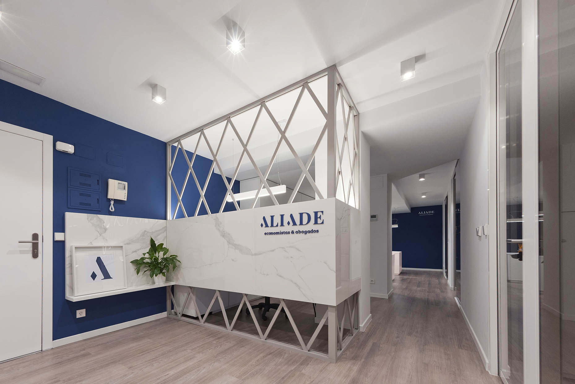
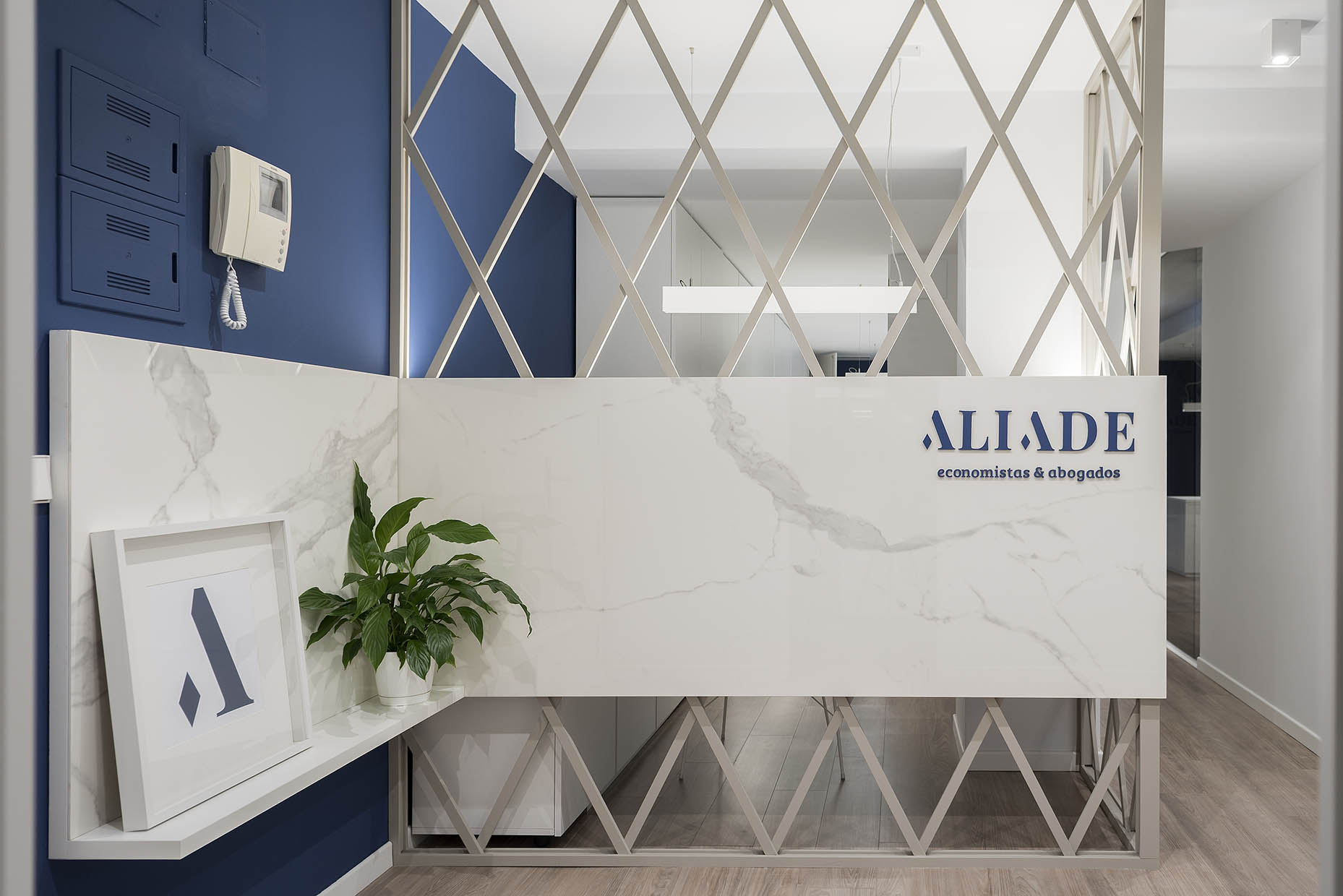
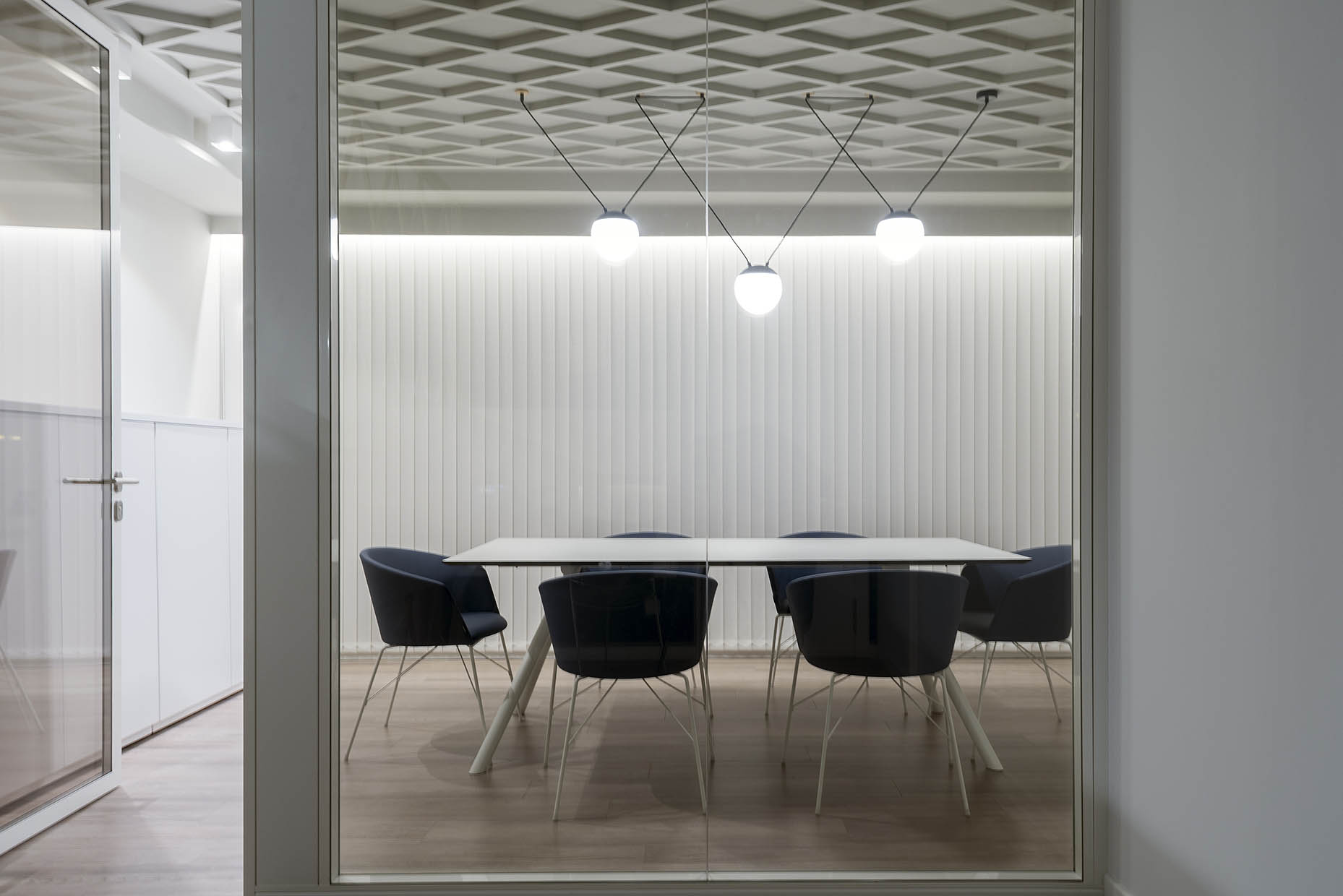
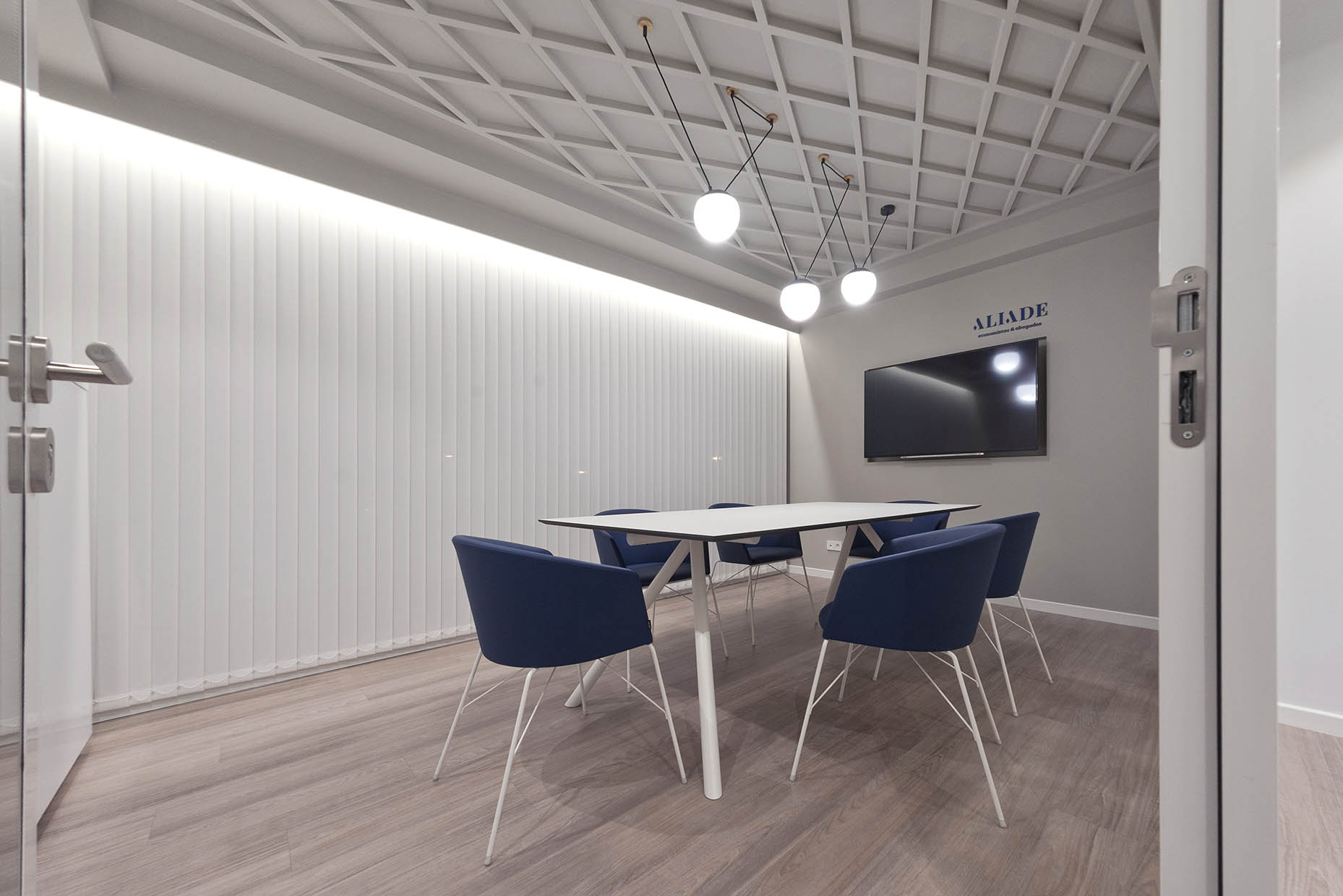
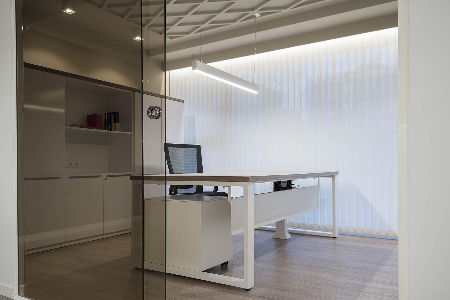
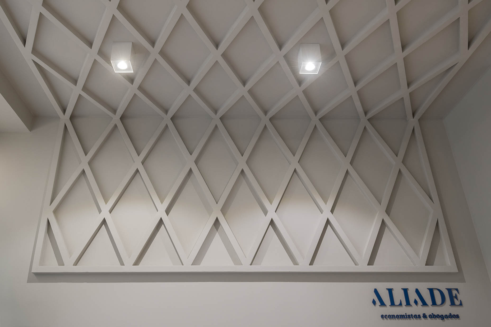
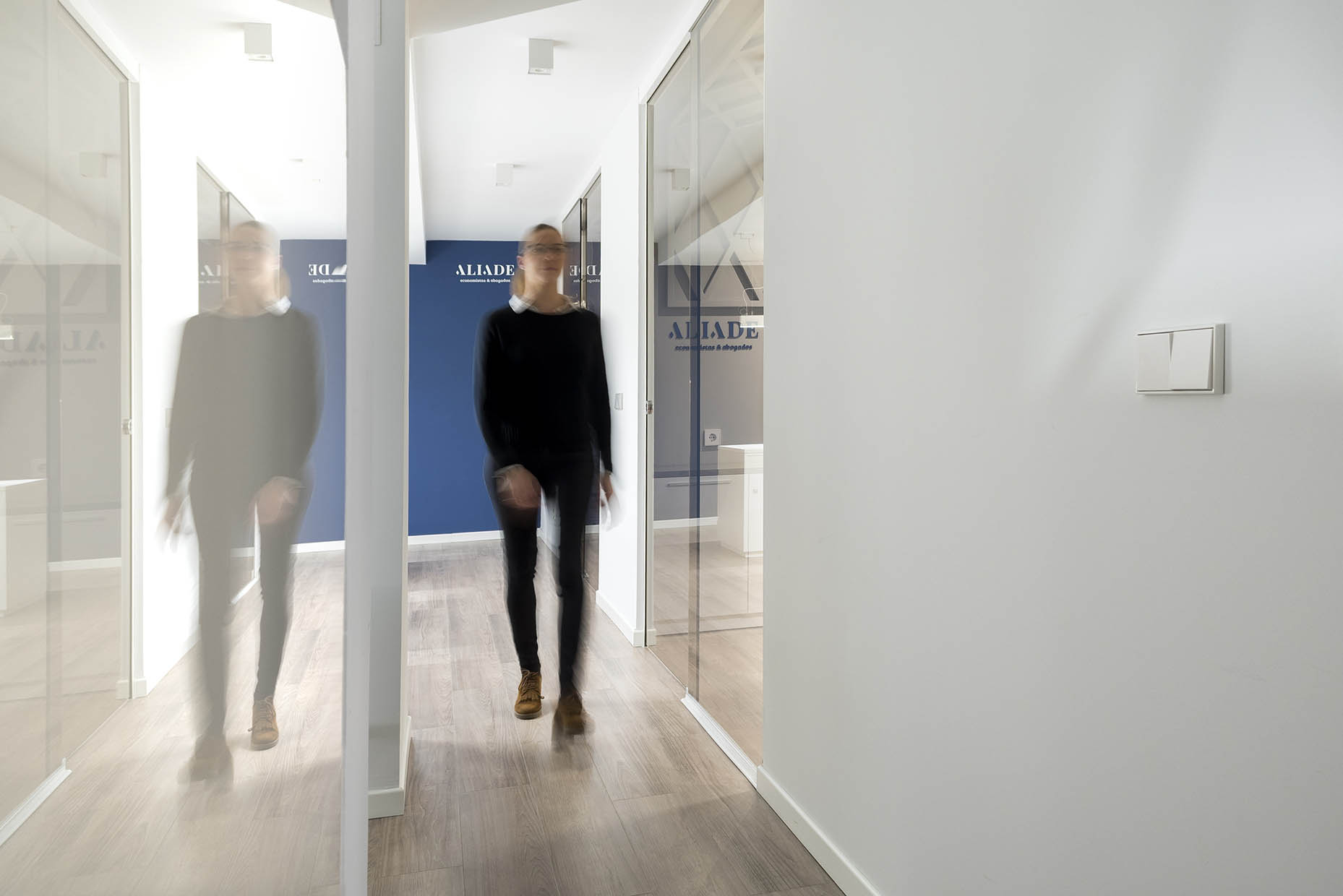
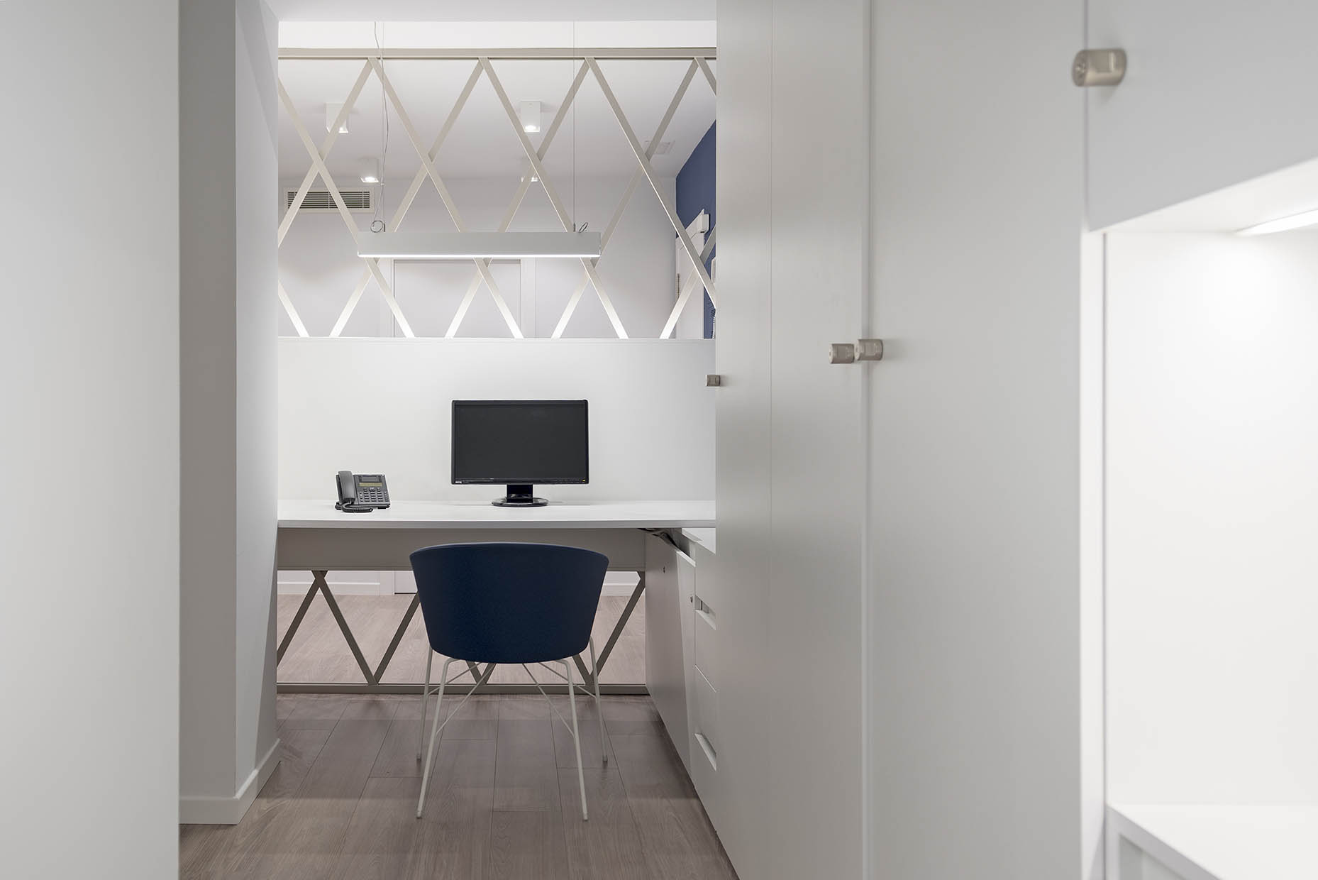
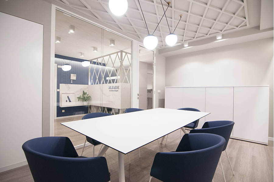
The concept of alliance, key to their work philosophy, becomes the thread that runs through the design, represented by a rhomboid pattern symbolizing connection and complementarity. The entrance lattice creates a smooth transition between the public and private areas, while the custom-made furniture optimizes storage and lighting.
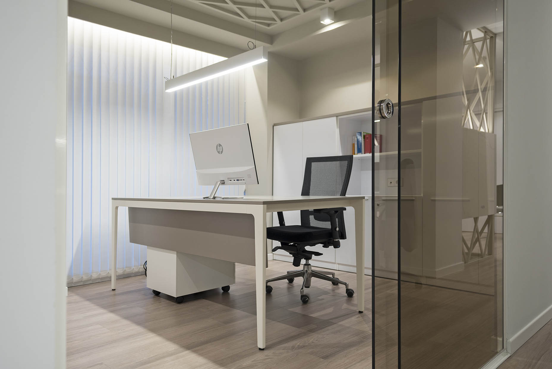
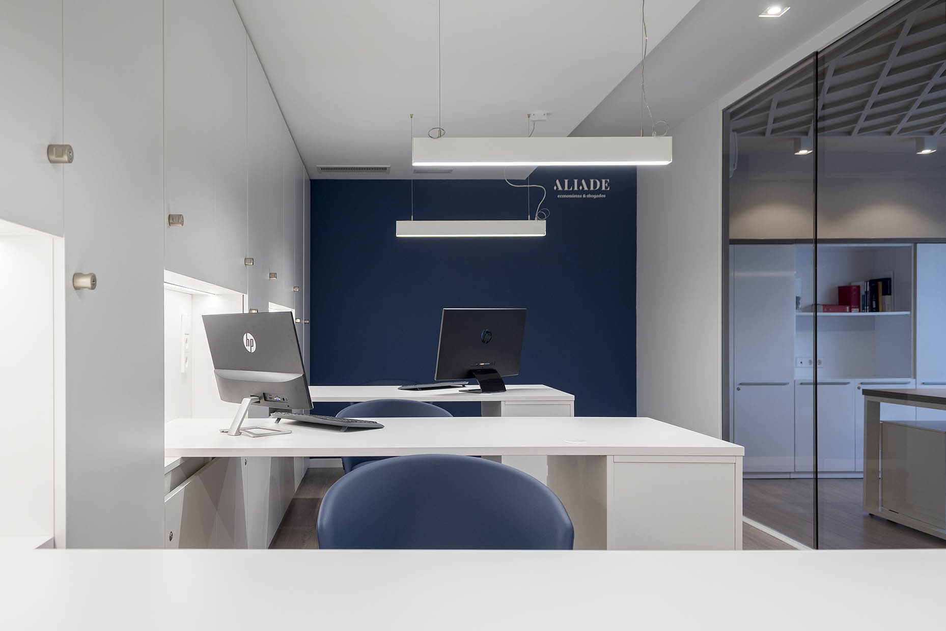
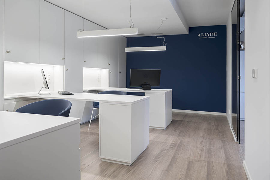
The design focuses on a cosmopolitan, elegant, and timeless aesthetic, using materials such as wood, marble, and darkened glass, creating a harmonious and sophisticated environment. On a base of natural tones, deep blue stands out as the corporate color.
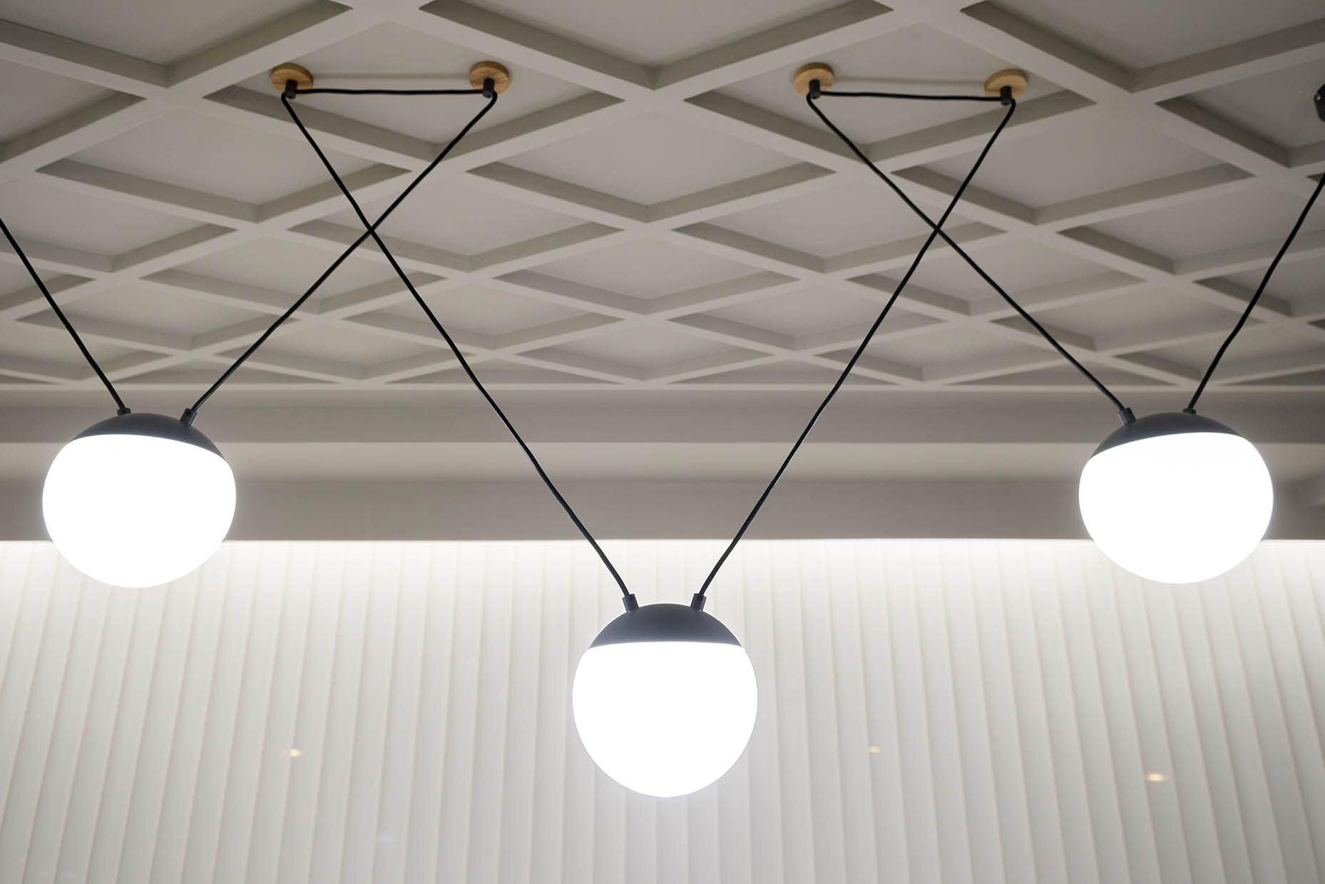
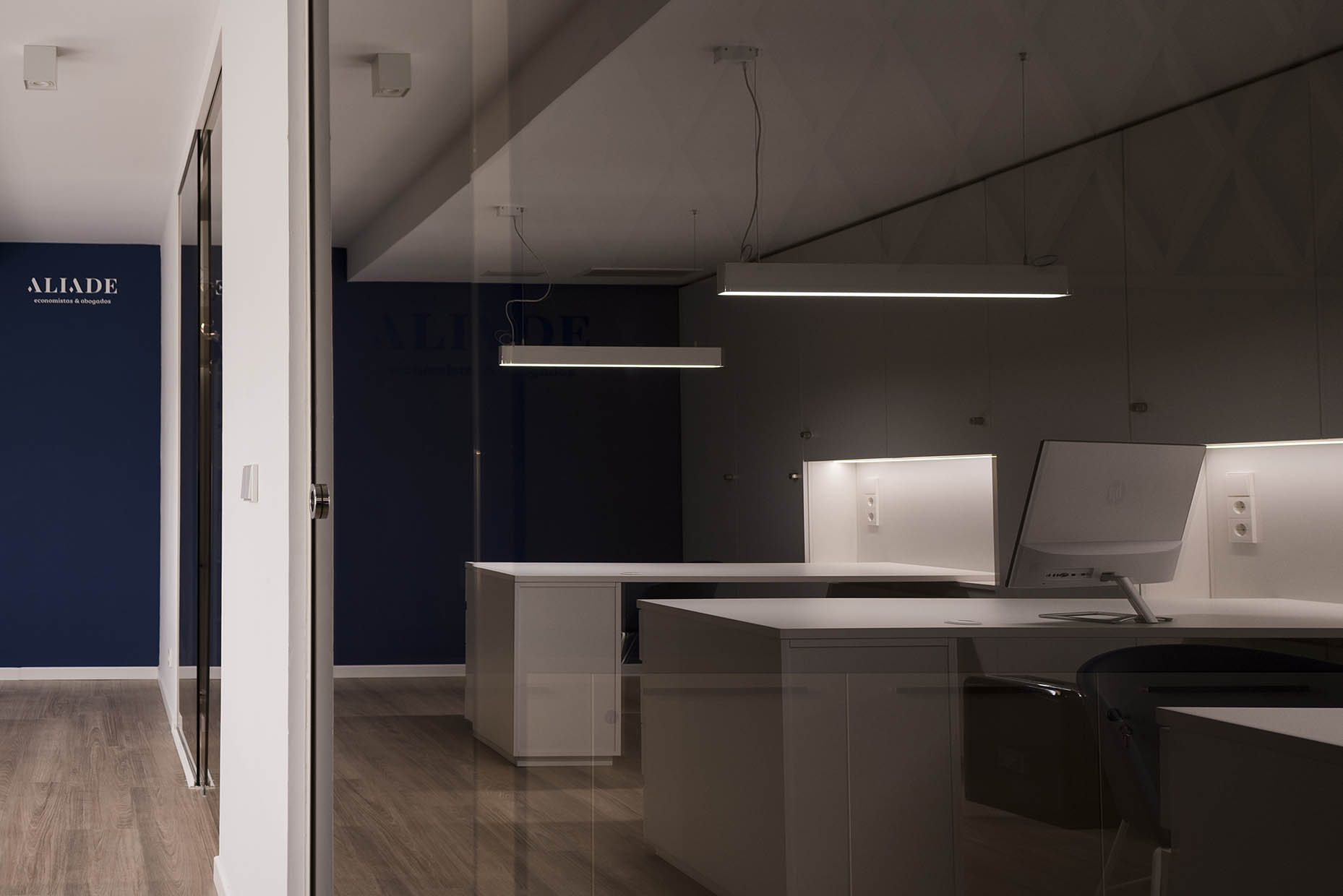
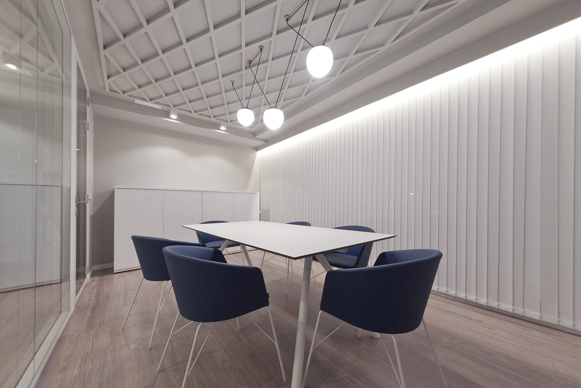
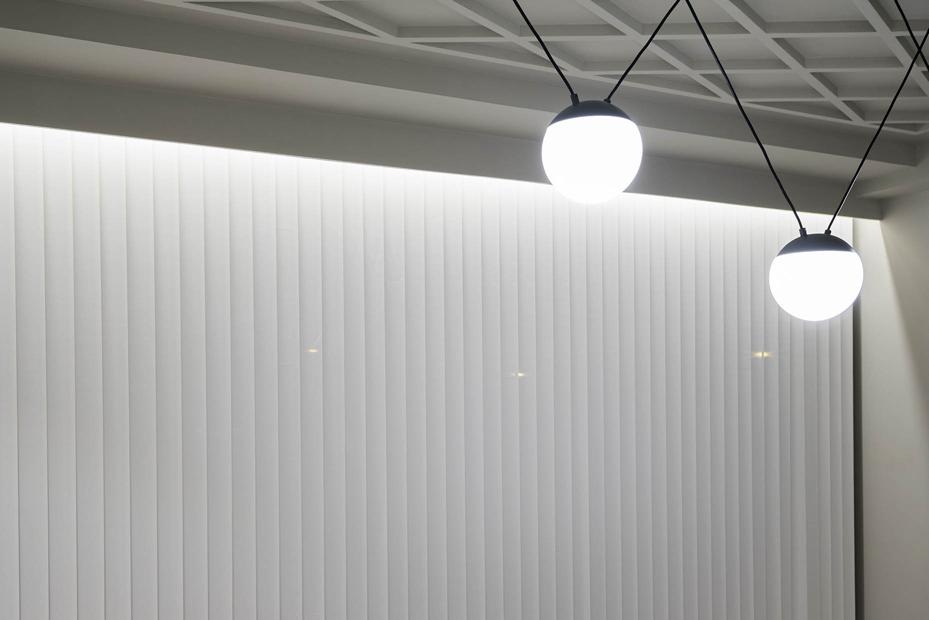
With just 80 m², the space is maximized to its fullest potential, integrating two private offices and an open area with four workstations. The multifunctional meeting room, located next to the entrance hall, allows for agile and efficient meetings. Elements such as the “W” table, the “Moon” armchair by Capdell, and the “Mine Space” lamp by Faro Barcelona add character to the design, while a slatted curtain regulates the natural light and unifies the atmosphere.
To improve acoustics and thermal comfort, a 3 mm-thick vinyl floor was chosen, which covers the original ceramic flooring without losing height.
.
If you want to know more wellness projects designed by Vitale, click here.
Interior Design: Vitale
Communication Strategy: Vitale
Branding y naming: Vitale
Photography: Alexis Sánchez, Vitale
Location: Castellón
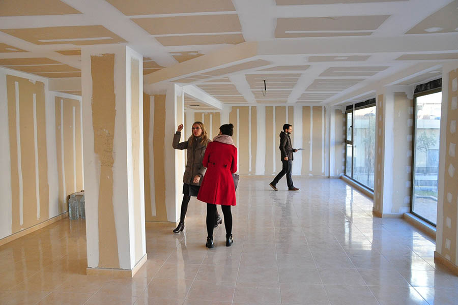
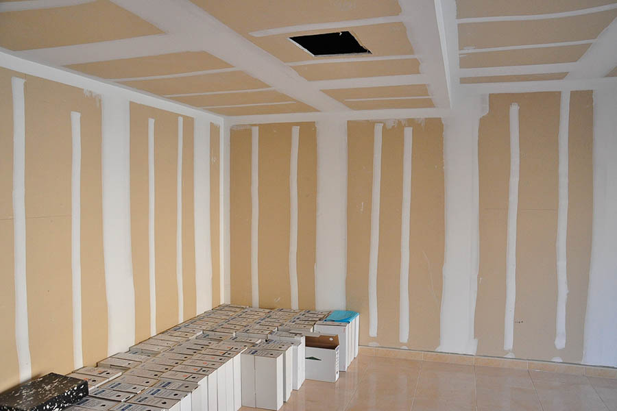
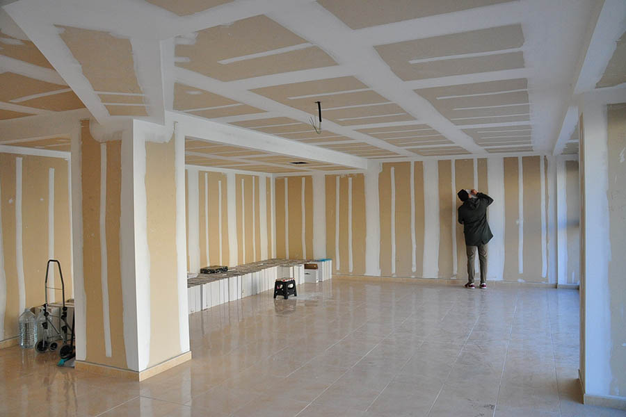
The office is located on the mezzanine level of a newly constructed building and has a glazed area with views of a square. However, the ceiling height is limited, which poses a challenge in the design possibilities and in concealing the air conditioning installations.
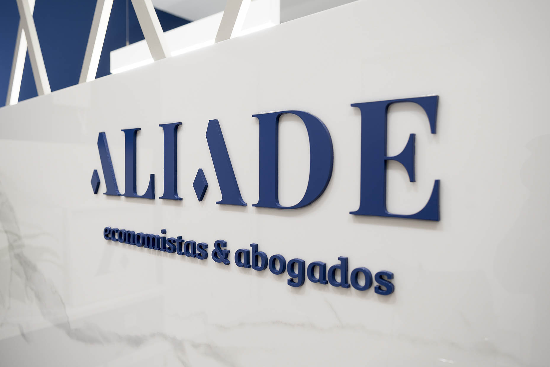
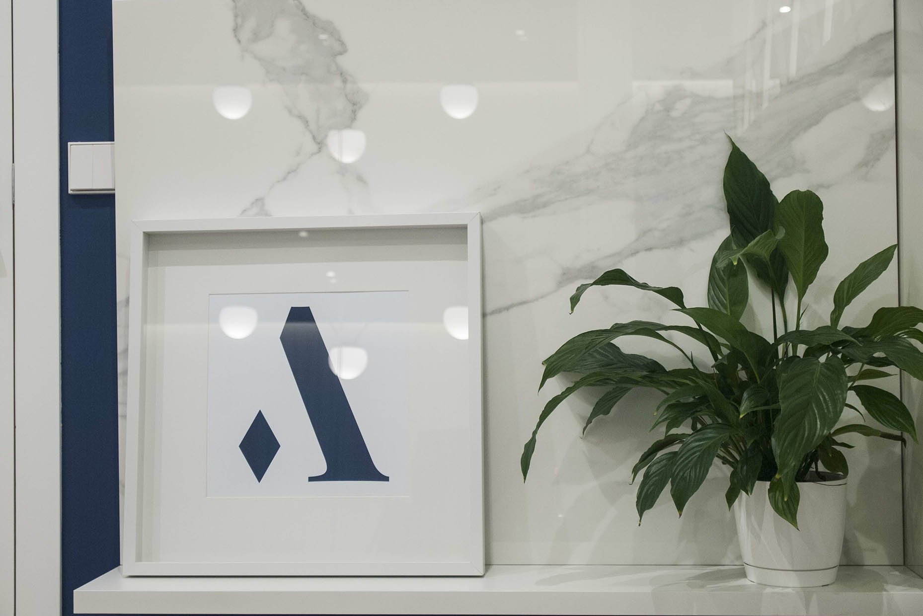
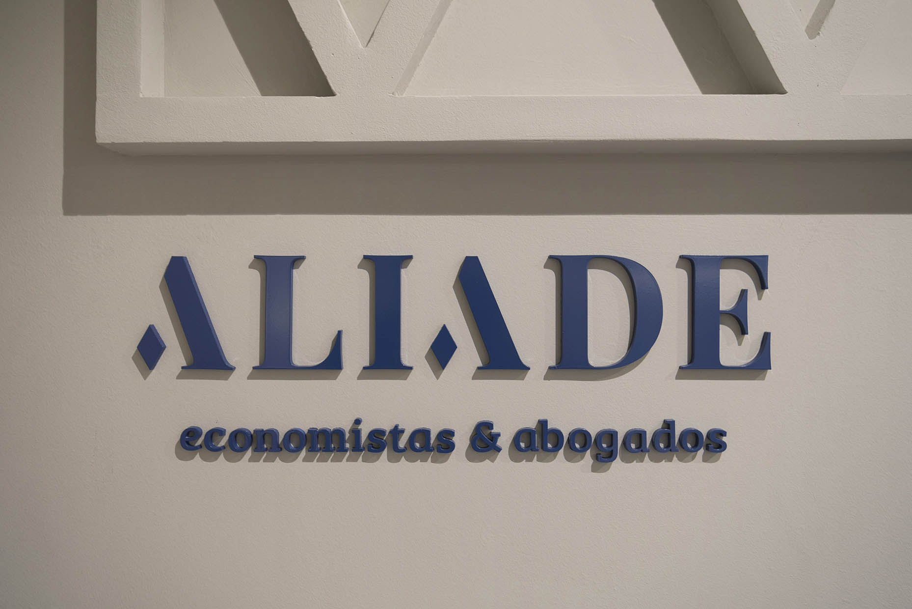
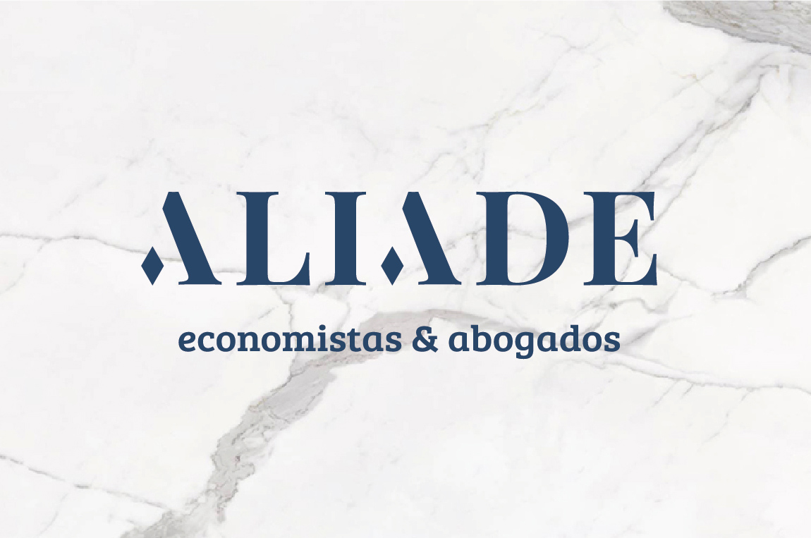
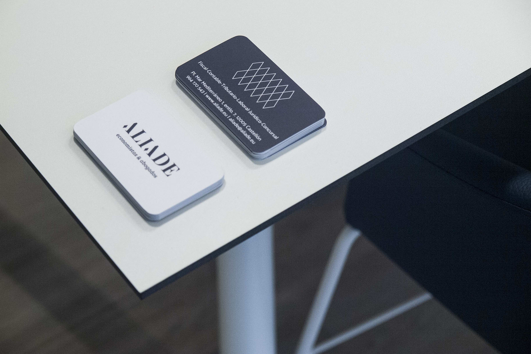
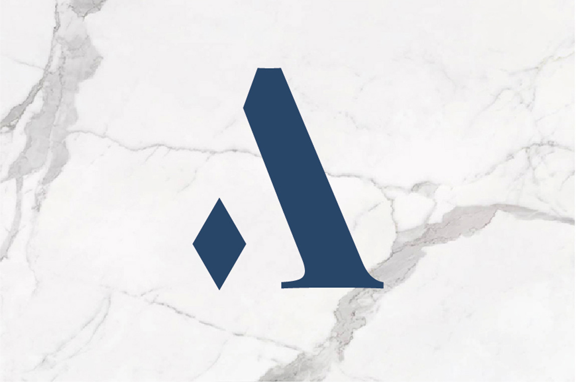
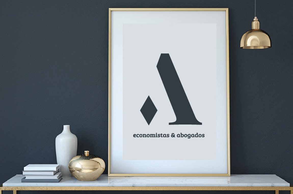
The branding of ALIADE begins with an evocative naming that merges the concepts of alliance and business management. The visual identity revolves around the idea of connection and complementarity, represented by a rhomboid figure inspired by the symbol of alliance. This pure and elegant geometry also evokes the solidity and durability of a diamond. The serif typography adds distinction and timelessness, while the logo, constructed from the “A” and the rhombus, strengthens the brand’s identity with balance and coherence.
The color palette combines a blue that conveys harmony and fidelity with warm gray tones that add elegance and a welcoming feel. This color selection reinforces the values of trust, professionalism, and closeness that define the brand.
We design
vital spaces.