Pediatric dentistry clinic
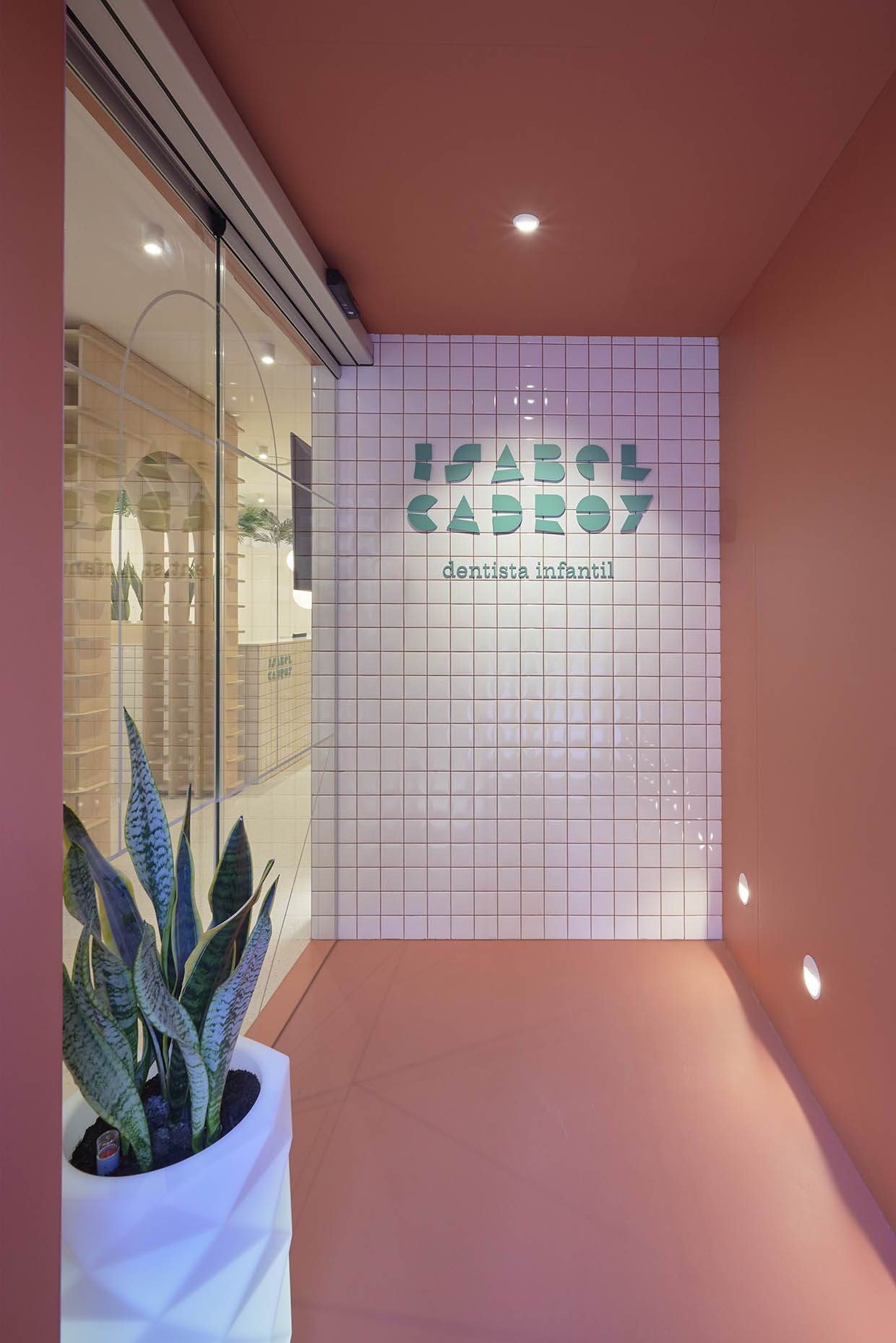
The interior design project for Dr. Isabel Cadroy’s pediatric dentistry clinic began with the definition of a new communication strategy to strengthen the clinic’s market positioning. The new location and brand renewal mark the start of a new chapter, consolidating its competitive advantage as a clinic exclusively dedicated to pediatric dentistry and orthodontics for children and teenagers.
For Dr. Cadroy, it was essential that the clinic feel welcoming and friendly without resorting to an overly childish aesthetic. The goal was to transform the usual stress and fear associated with dental visits into confidence and tranquility. Vitale designed a corporate space that connects with all audiences, creating a positive, family-friendly, and soothing environment.
Design of the clinic’s communication strategy
The project highlights the clinic’s corporate philosophy: the importance of educating families to ensure good oral health and improve patients’ quality of life. With this in mind, Vitale developed a narrative emphasizing the idea of “learning at the dentist,” conceptualizing the essential communication role the clinic plays in making dental treatments and processes understandable.
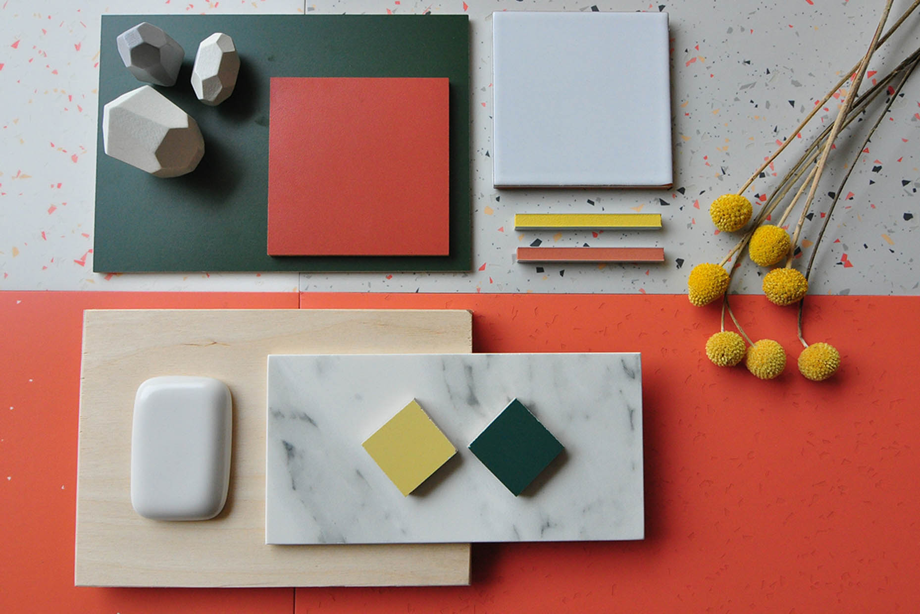
Inspiration and decoration of the Cadroy dental clinic
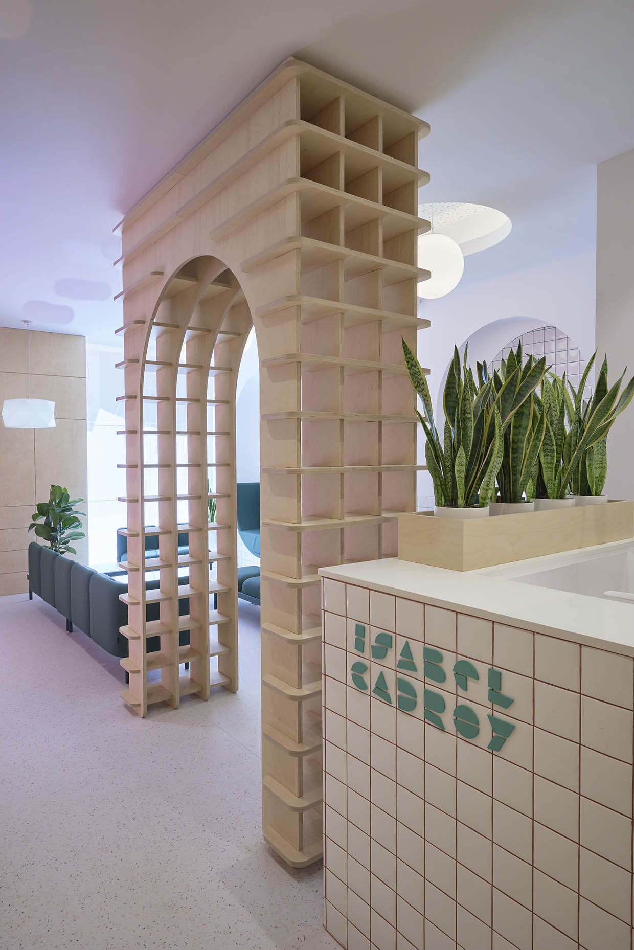
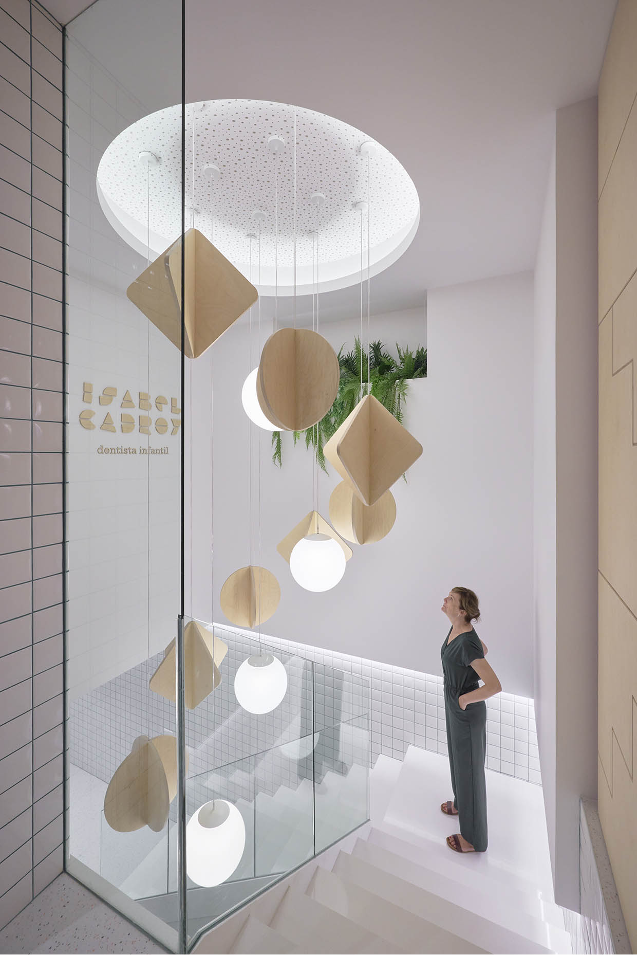
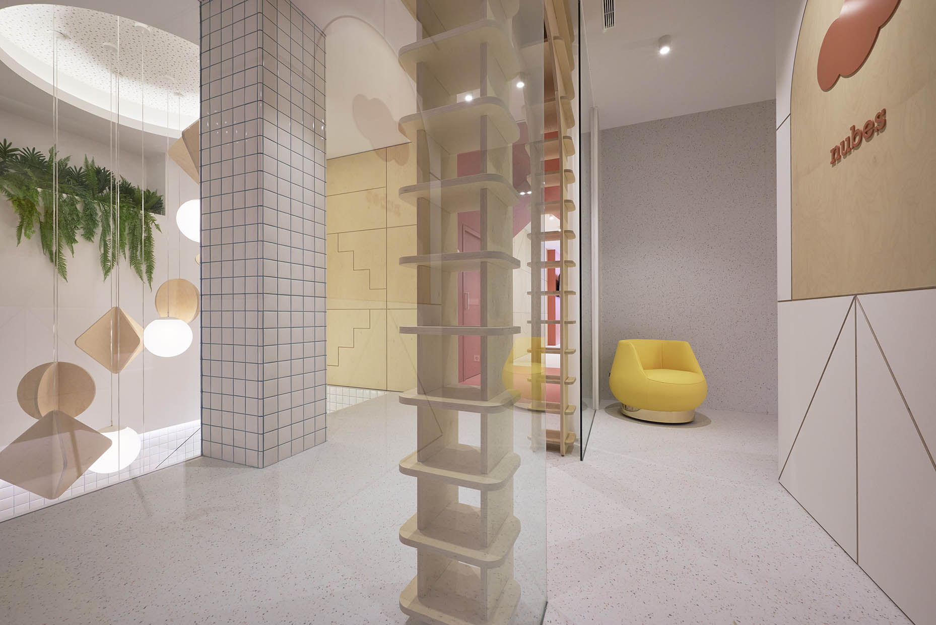
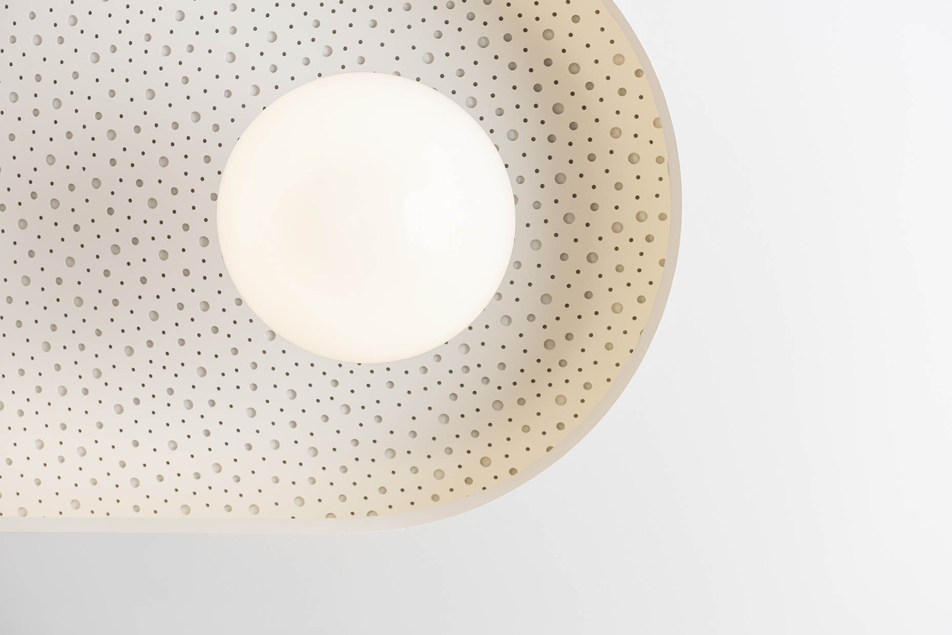
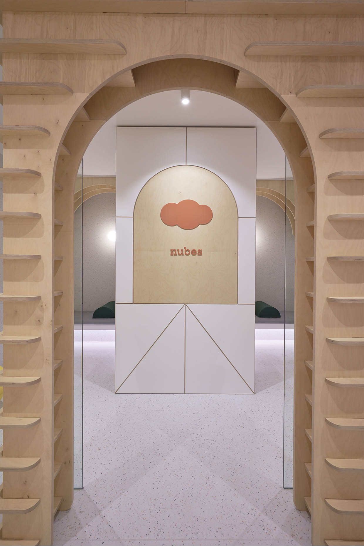
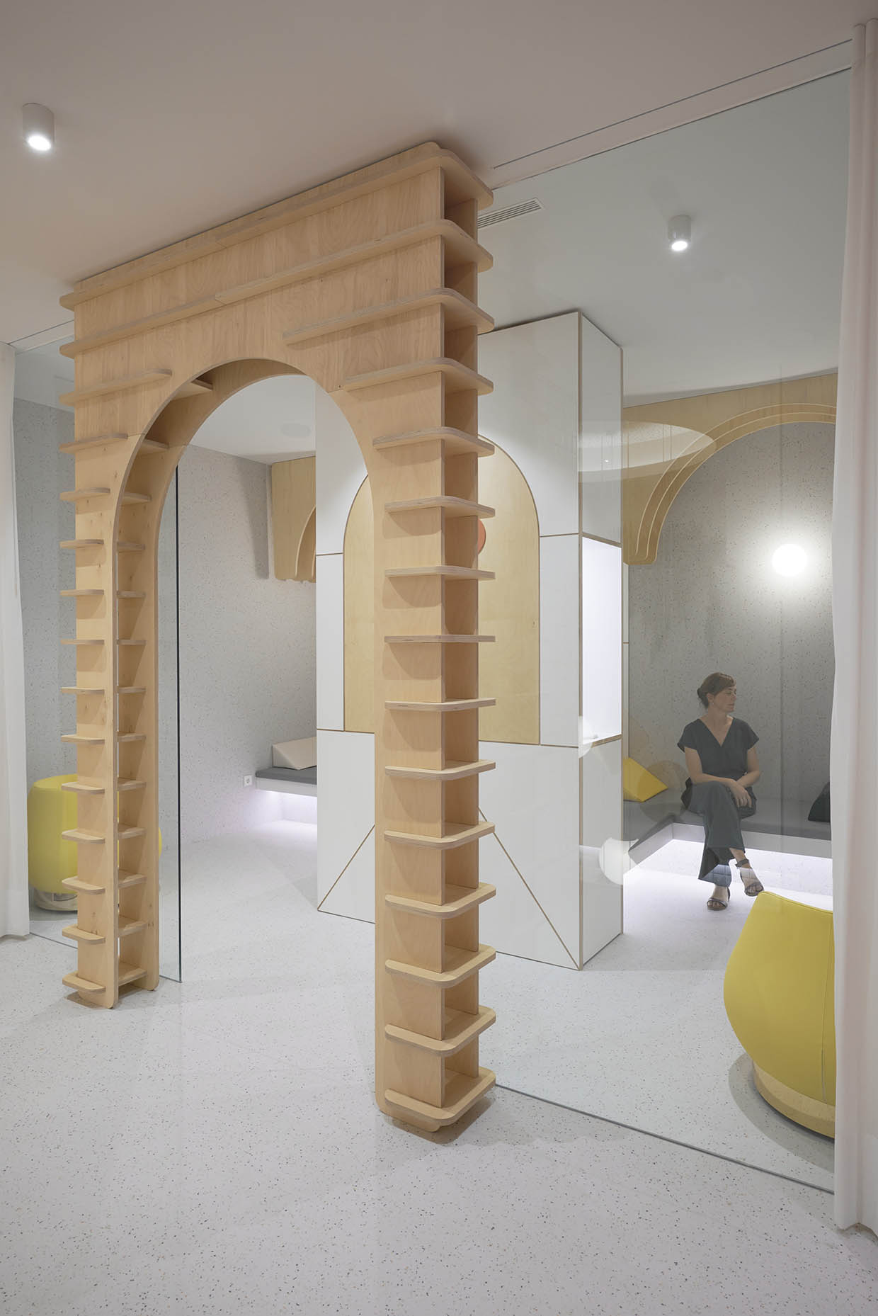
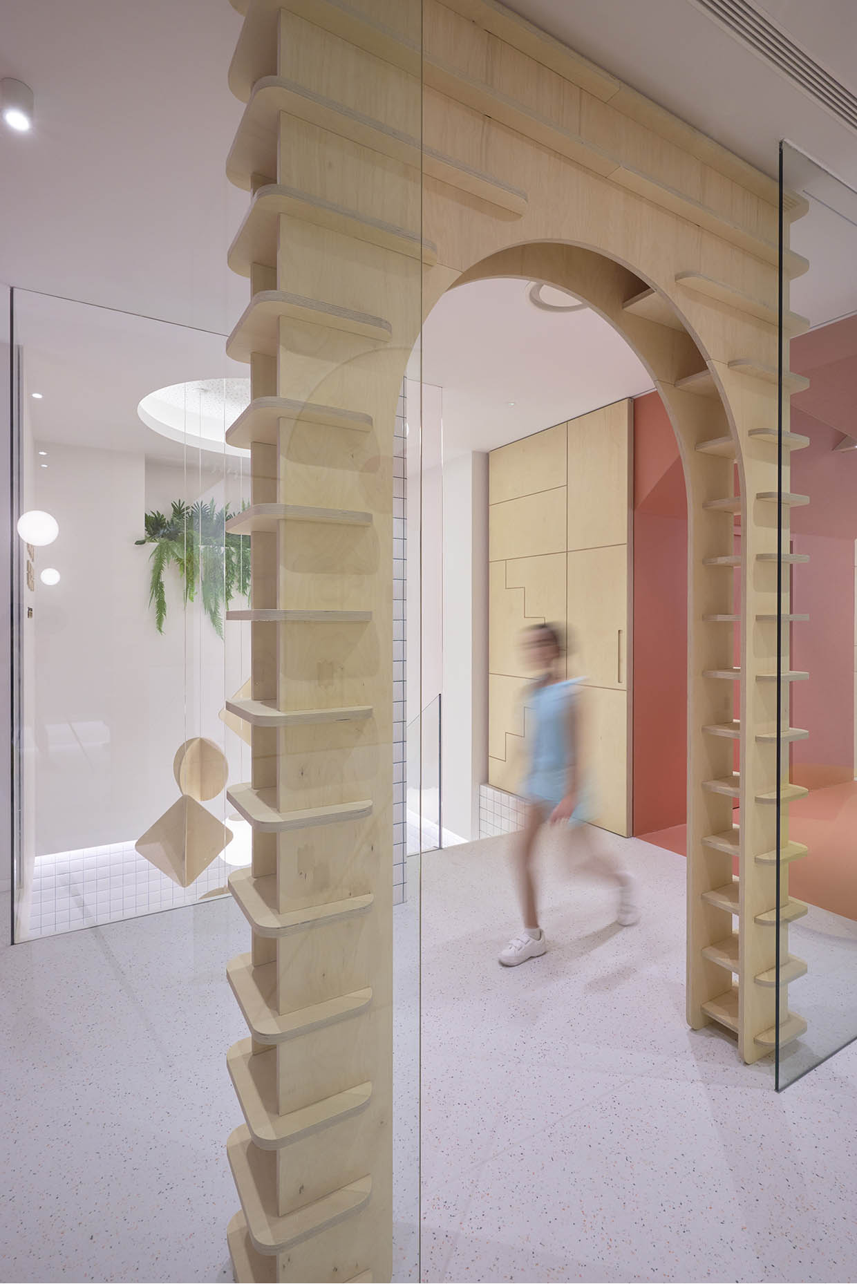
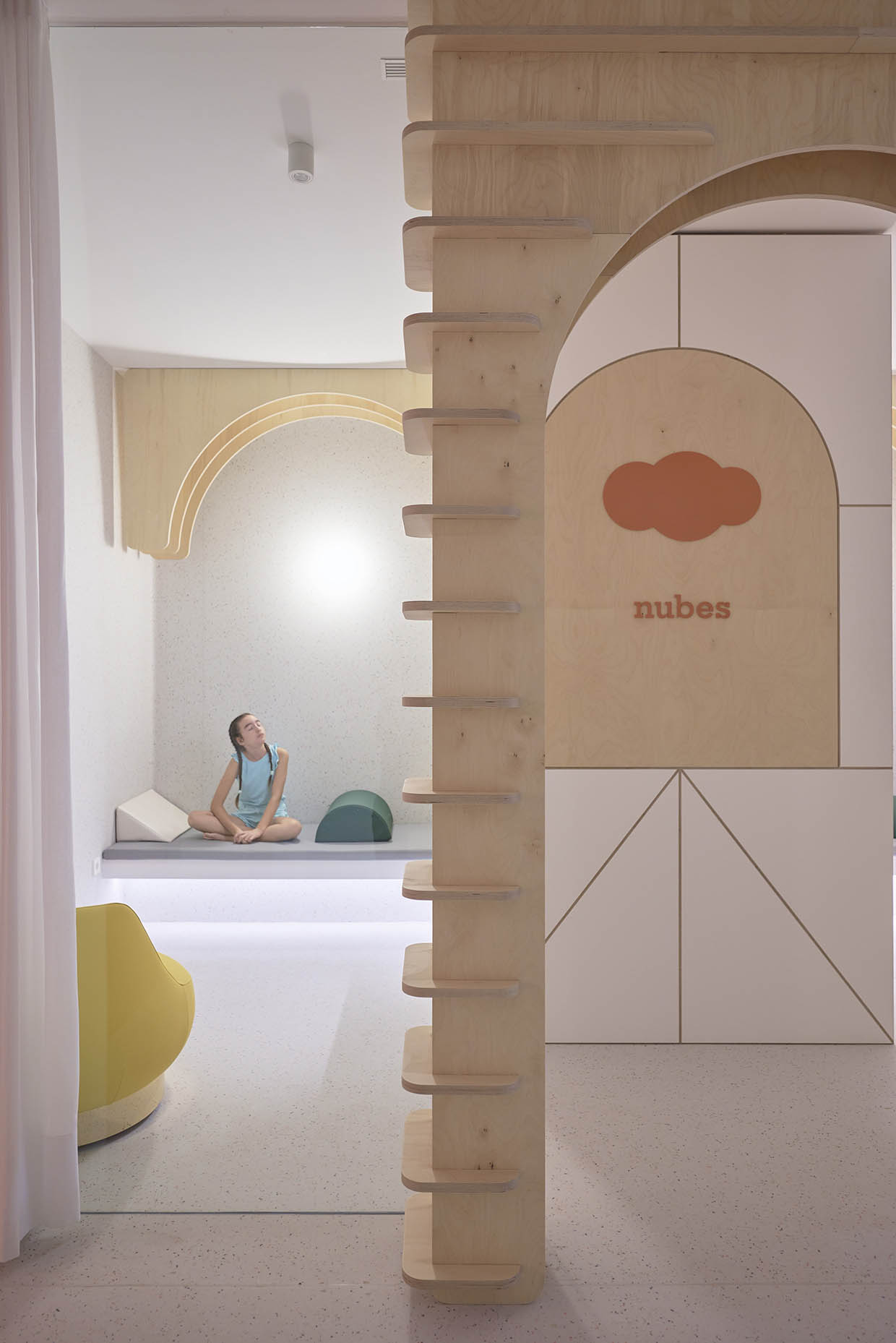
The creative axis draws inspiration from cognitive development learning methods. The branding and corporate interior design are based on wooden building blocks and elementary geometric puzzles. The clinic surprises both children and adults with oversized, recognizable elements reminiscent of childhood learning, such as grand wooden archways, pendant lamps shaped like mobiles, and puzzle-like paneling. The result is a space that evokes nostalgia, connecting with the child within and transporting visitors into a world of discovery.
The clinic spans two floors (totaling 350 m²) and is organized to meet an extensive set of functional requirements. The ground floor houses patient care areas, including reception with a waiting area, radiology, sedation room, treatment rooms with a sterilization area, a post-treatment room, a children’s bathroom, and an adult bathroom. The basement level accommodates a laboratory, a training and meeting room, a spacious private staff area (with changing rooms and a break room), a storage room, and an equipment room.
Clinic waiting room design
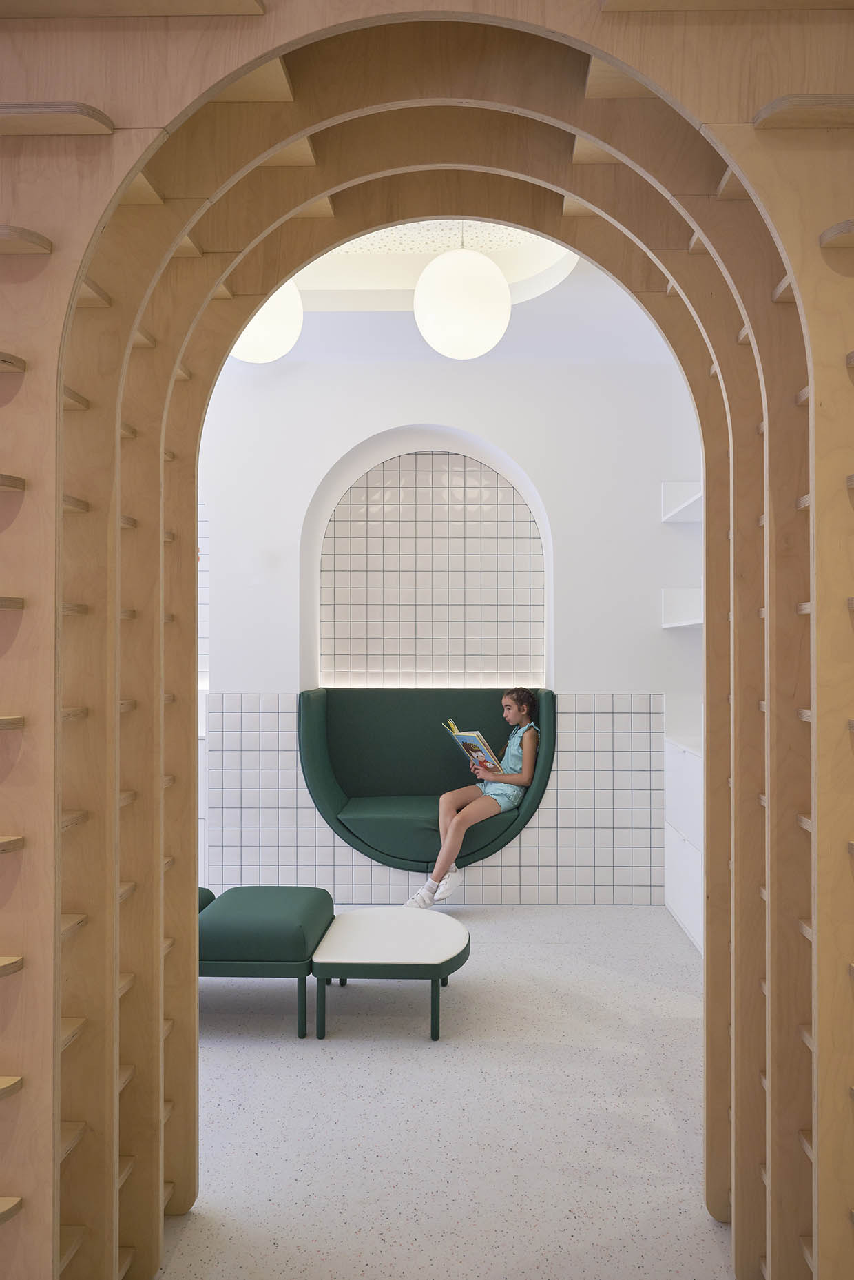
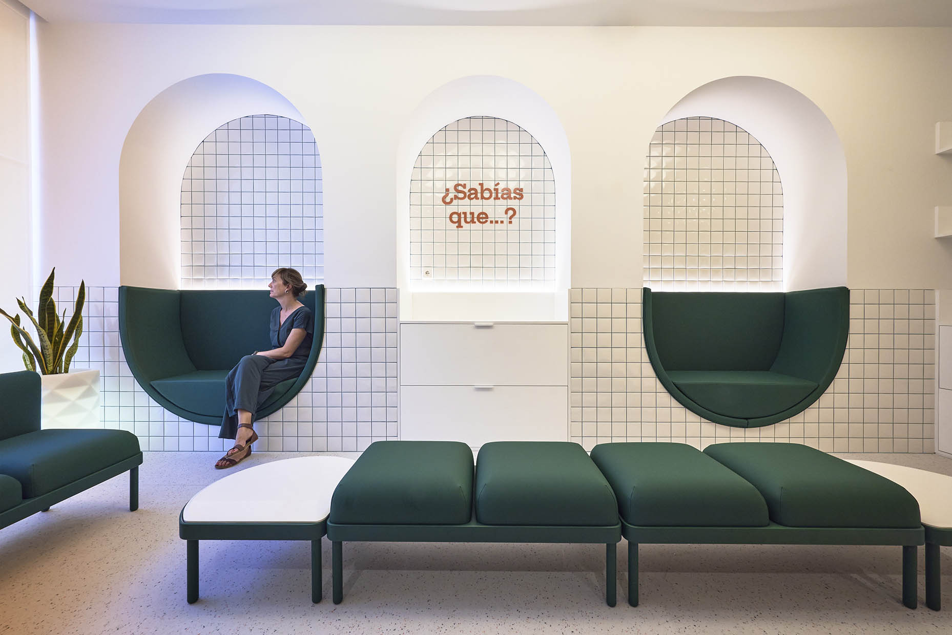
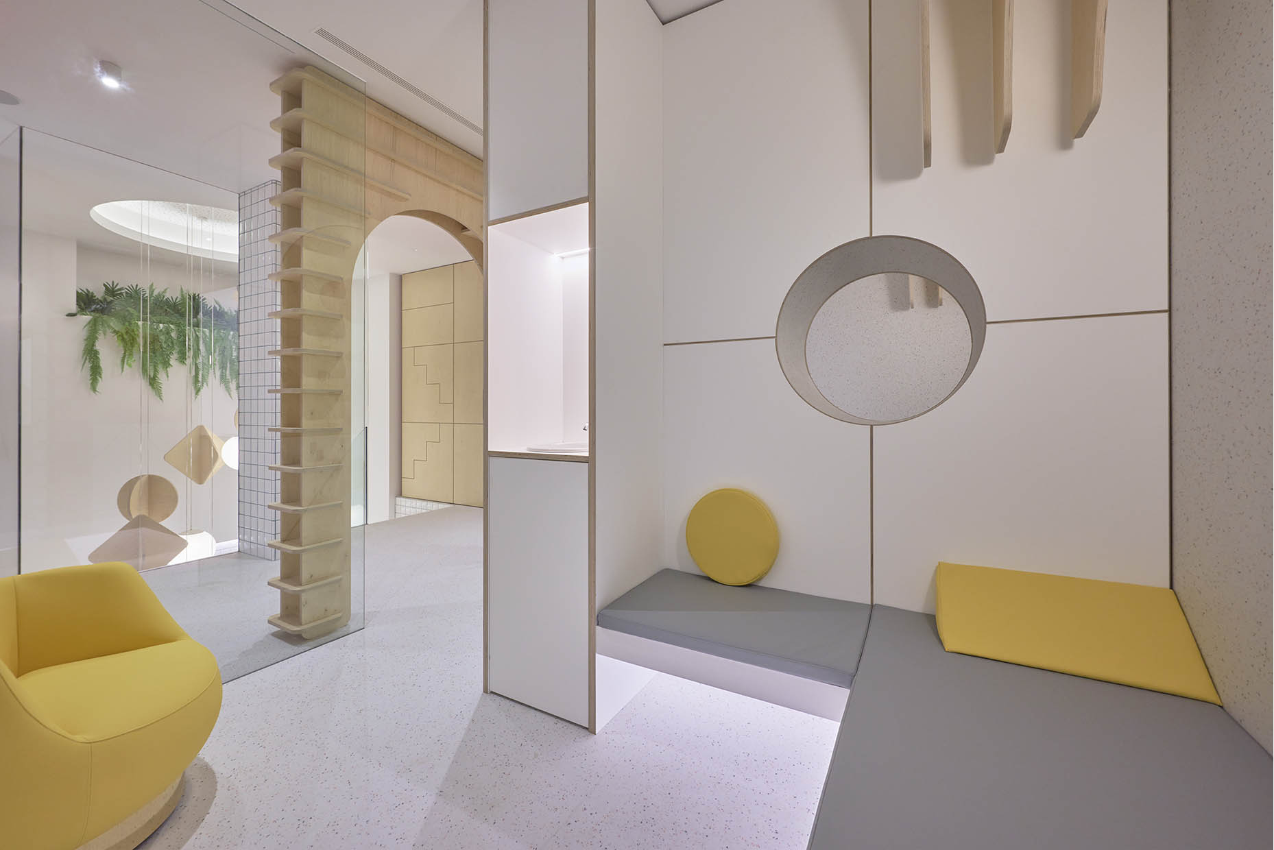
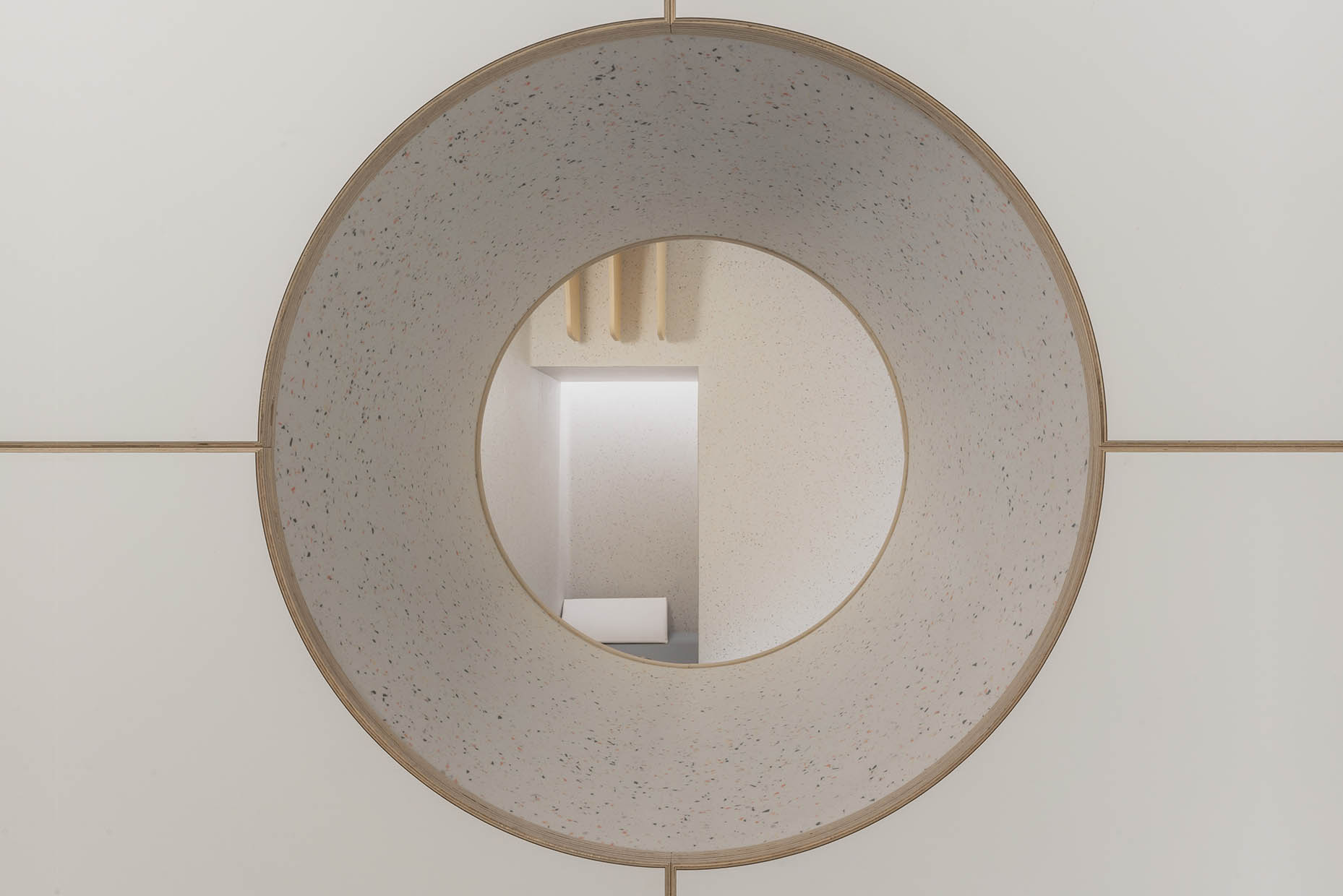
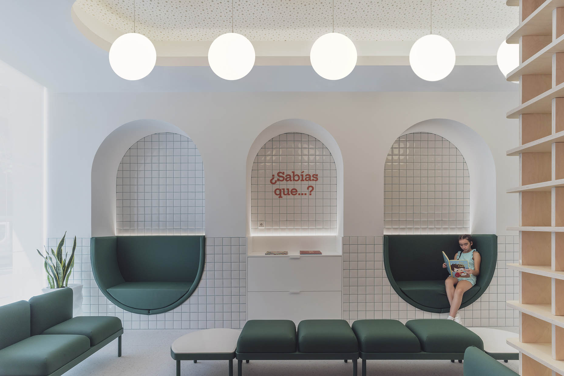
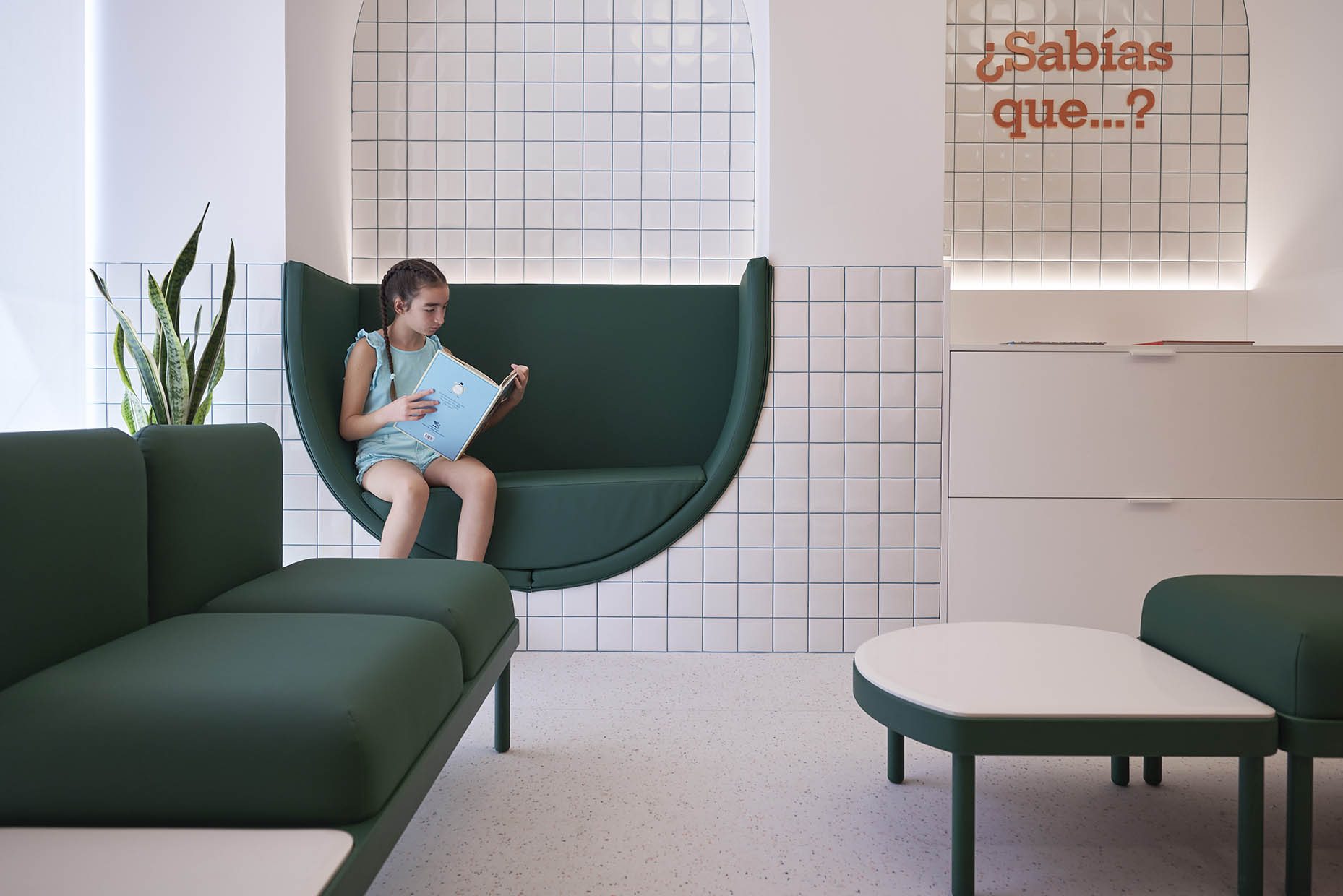
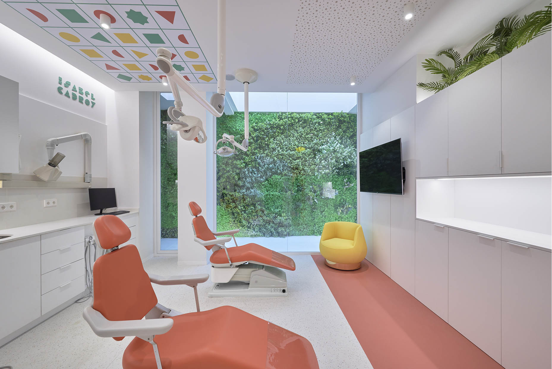
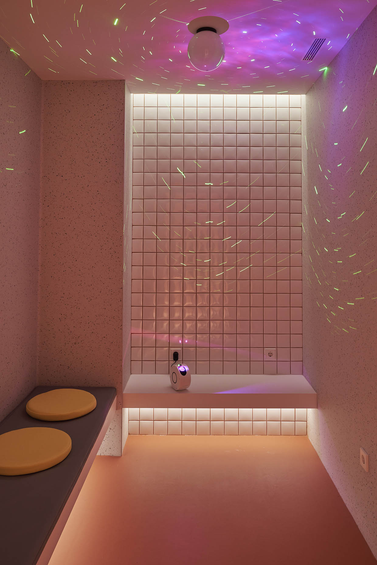
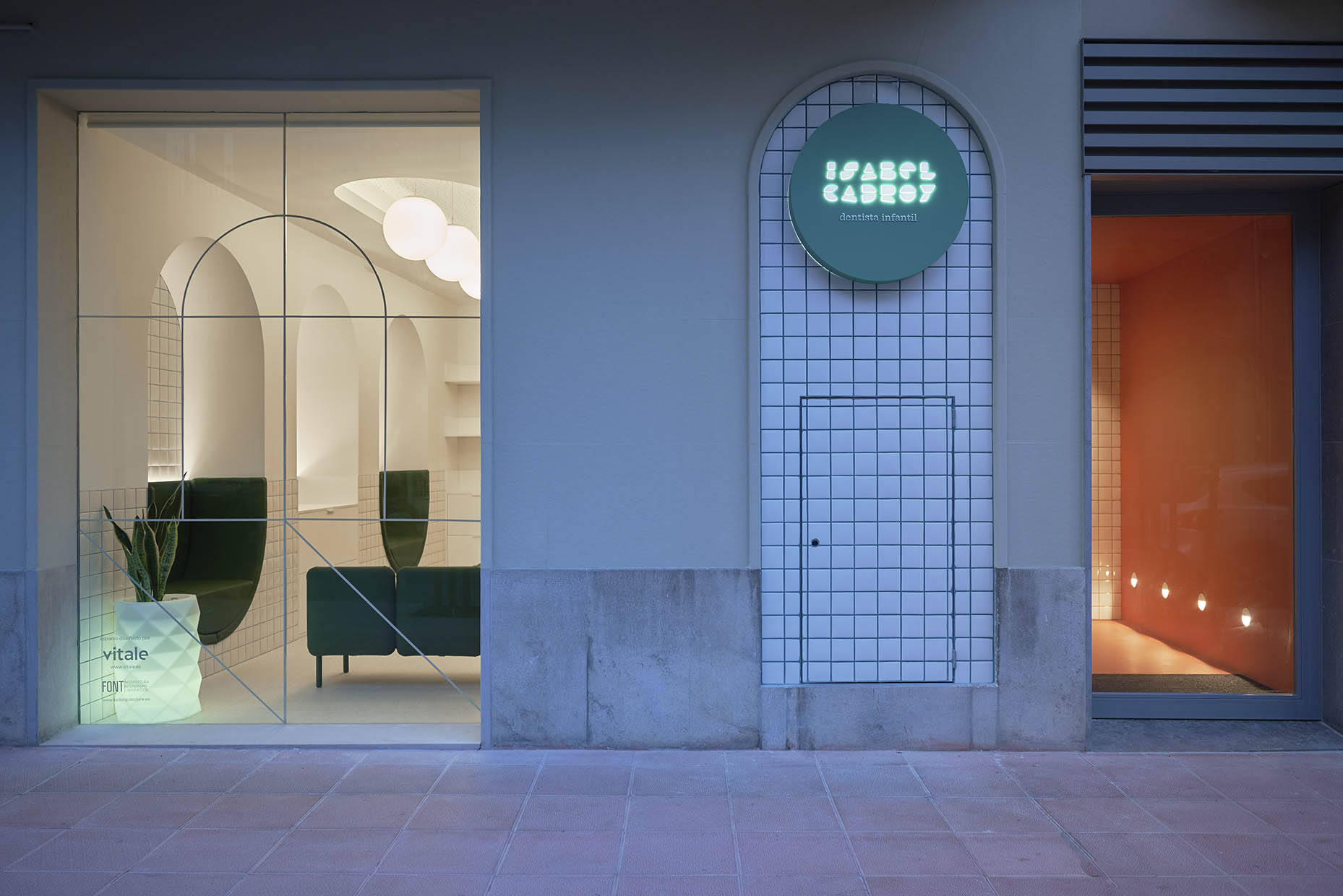
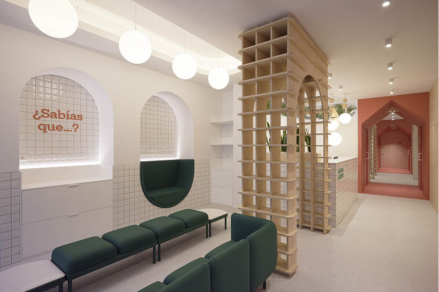
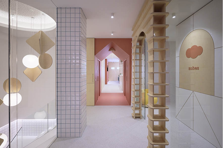
The waiting area is a bright space that opens to the exterior, defined and articulated by versatile, modular furniture. Upon entry, visitors pass through a striking three-meter-high wooden archway, leading to capsule-shaped alcoves with plush upholstery that invite relaxation and provide a sense of security. The objective is to create a calm and reassuring atmosphere using soft forms and warm, indirect lighting.
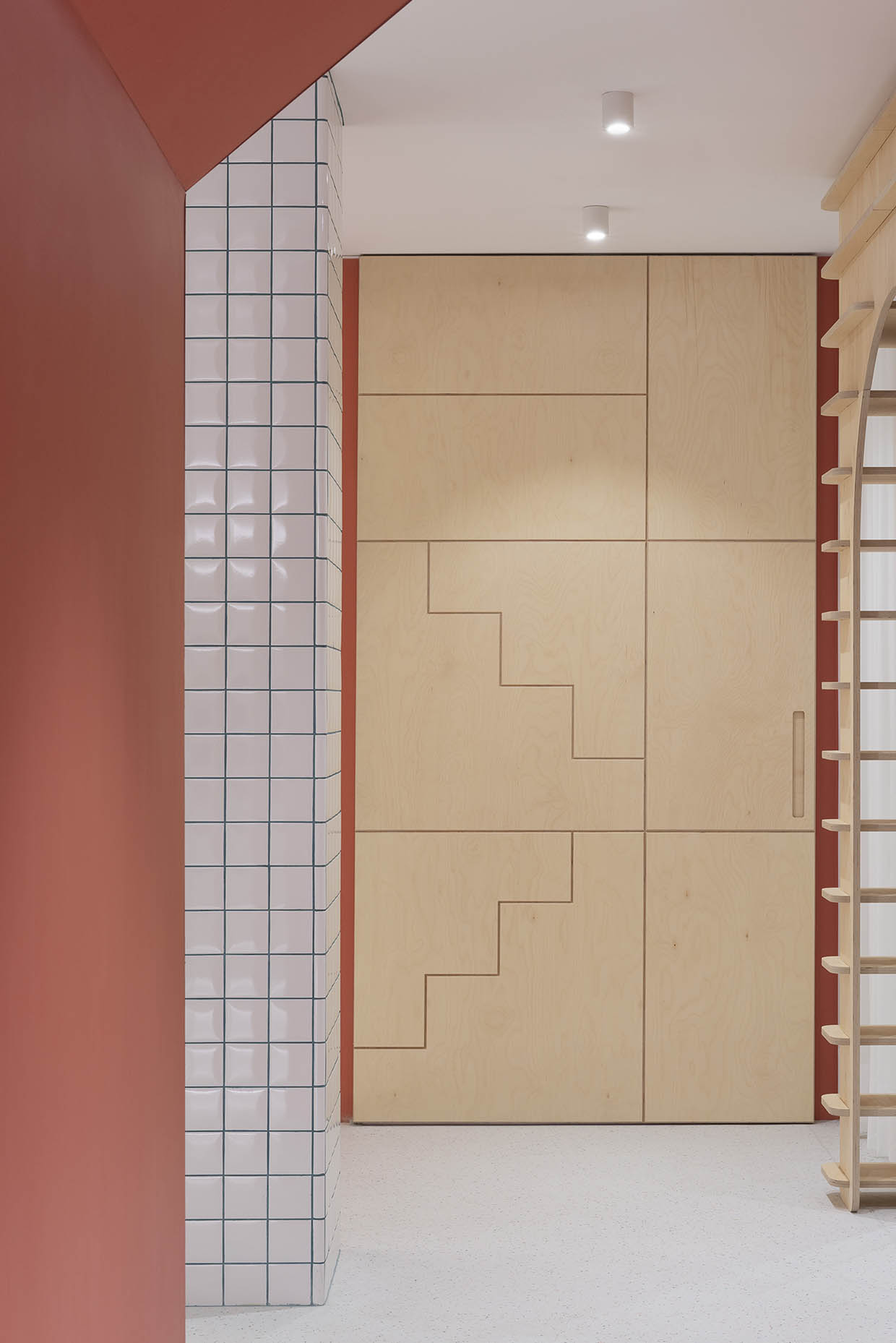
The reception area features 10×10 cm ceramic tiles grouted in the brand’s corporate color, resembling the grid pattern of school notebooks. Walls are protected with CNC-cut birch plywood paneling, adding warmth and serenity. Greenery plays a key role in high-contact areas such as the reception and treatment rooms, enhancing mood and well-being.
Reception and dental offices
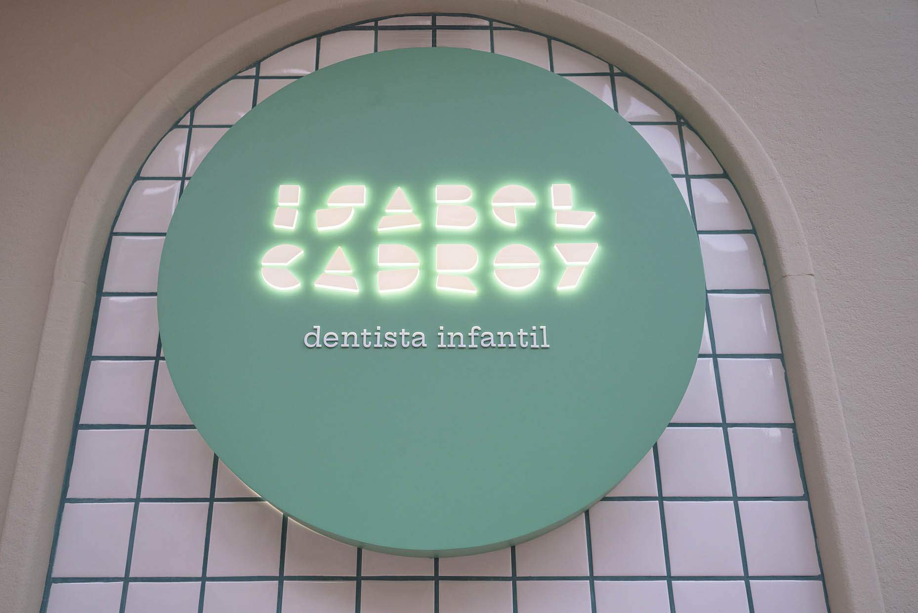
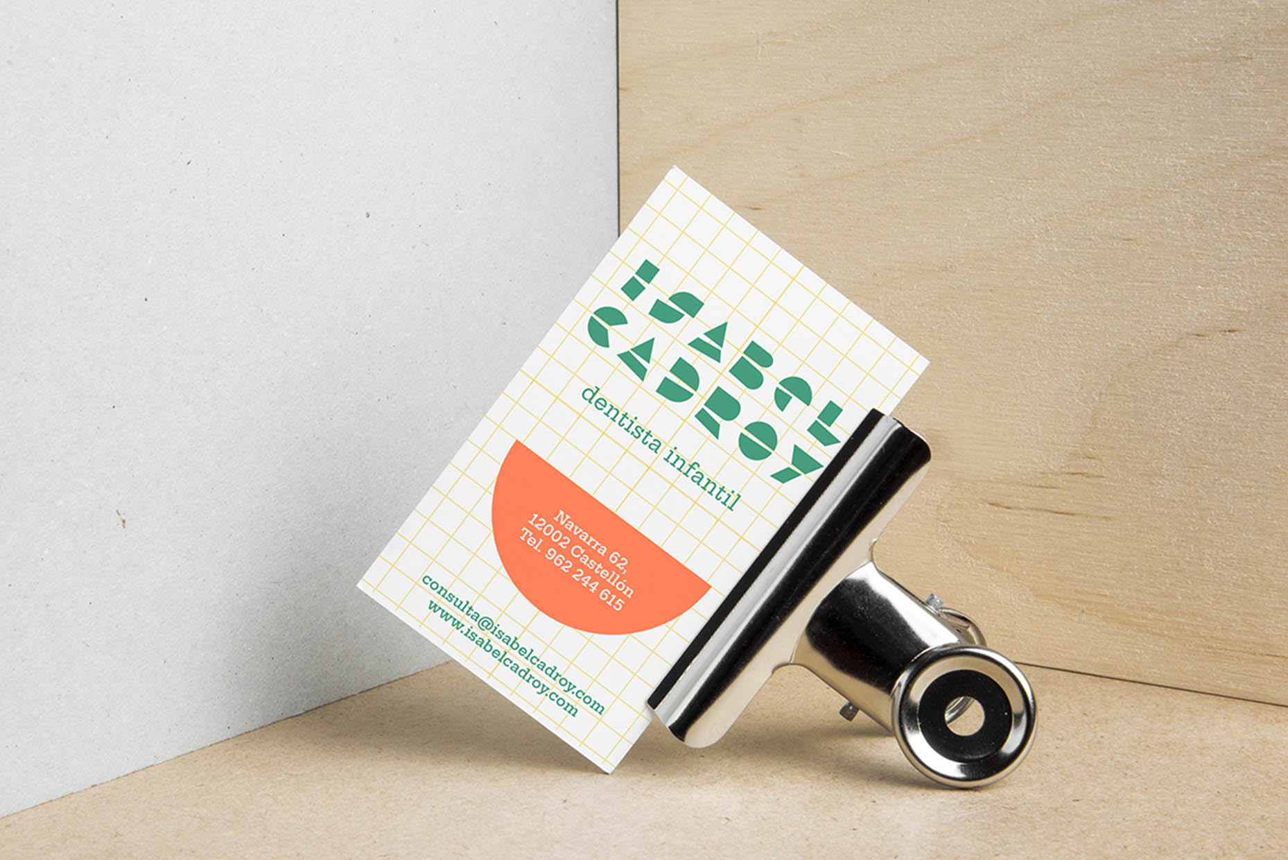
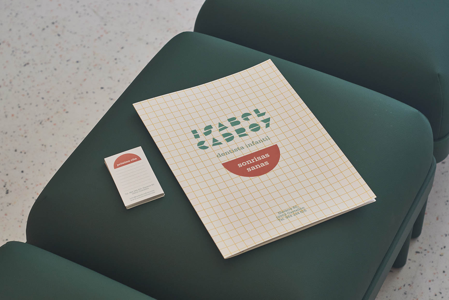
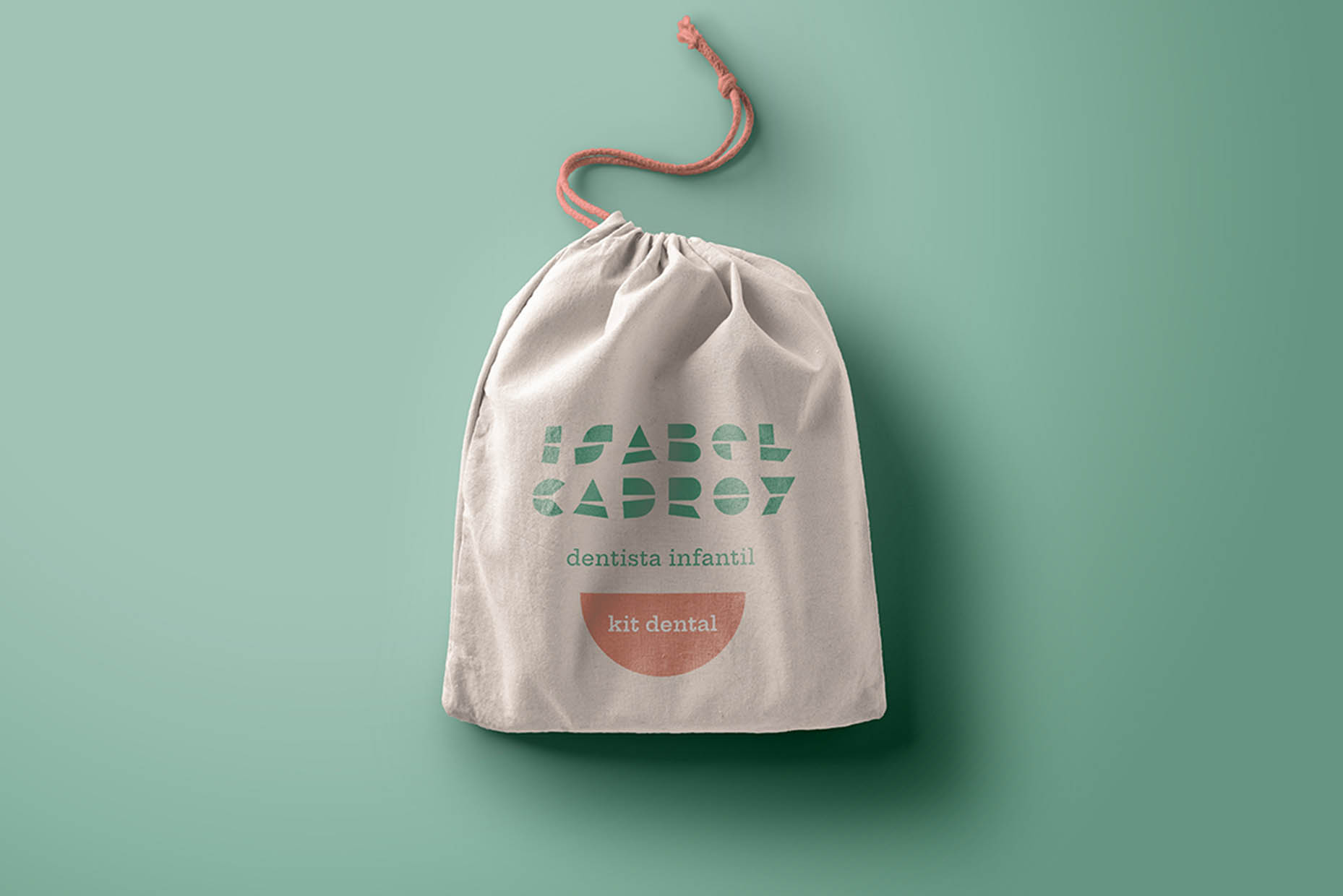
The clinic’s branding and corporate colors are seamlessly integrated into the design, subtly accompanying visitors throughout their experience. The new brand identity is built around a typography composed of elemental geometric shapes (circles, triangles, rectangles, etc.). The result is a bold and structured identity inspired by the visual language of building blocks, reinforcing the educational theme.
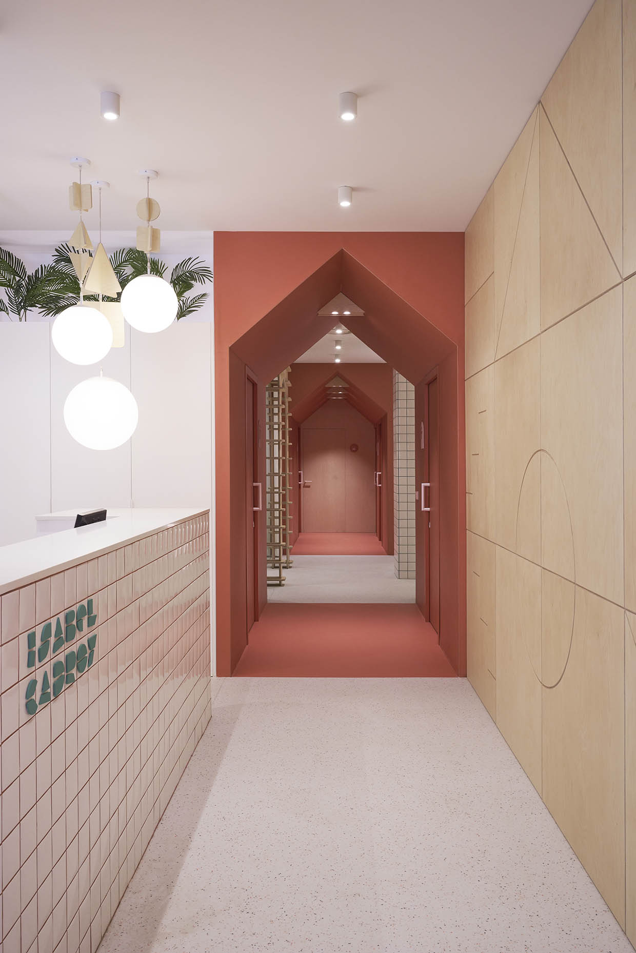
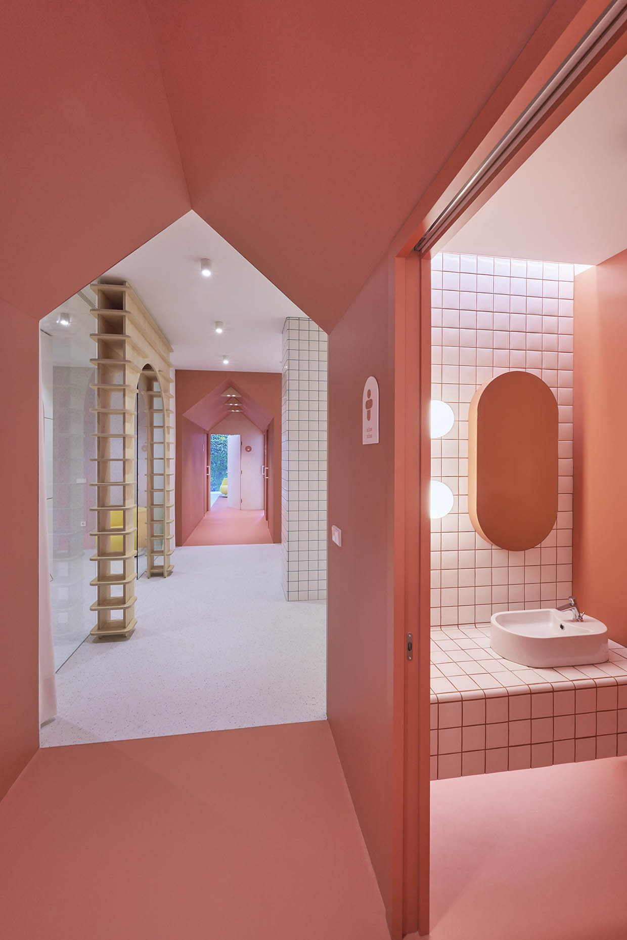
Layout and functionality of the dental clinic
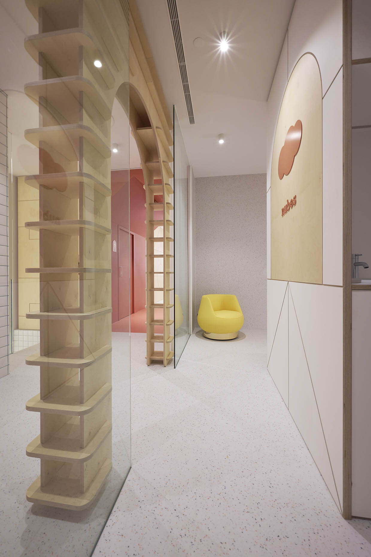
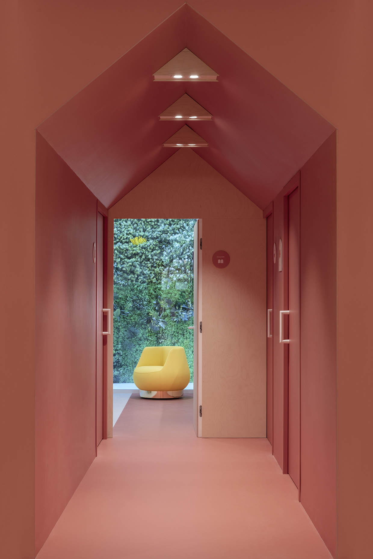
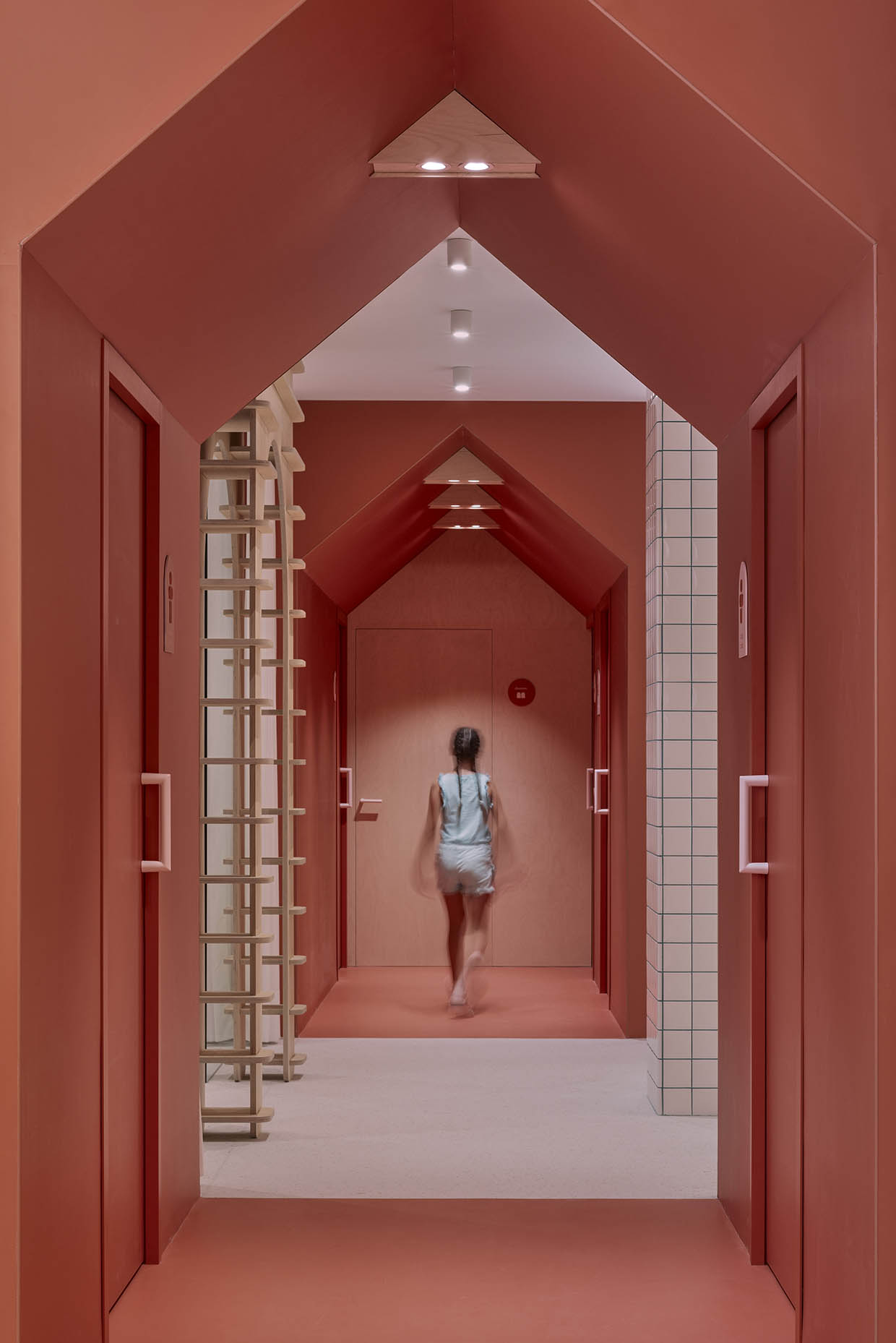
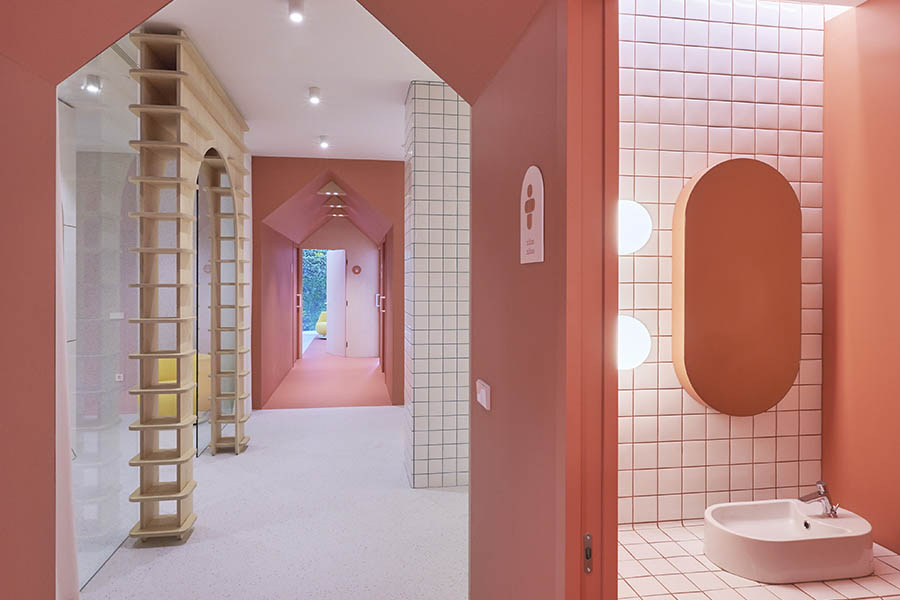
Circulation areas are designed as dynamic tunnels that create rhythm and a welcoming, home-like feel. The first tunnel houses the bathrooms and serves as a transition between the entrance and the main clinic area. This passage leads to a central hub that connects to the radiology room, the post-treatment area—framed by another wooden archway and left open when not in use—and the basement stairway. A spectacular five-meter-high mobile illuminates the stairwell.
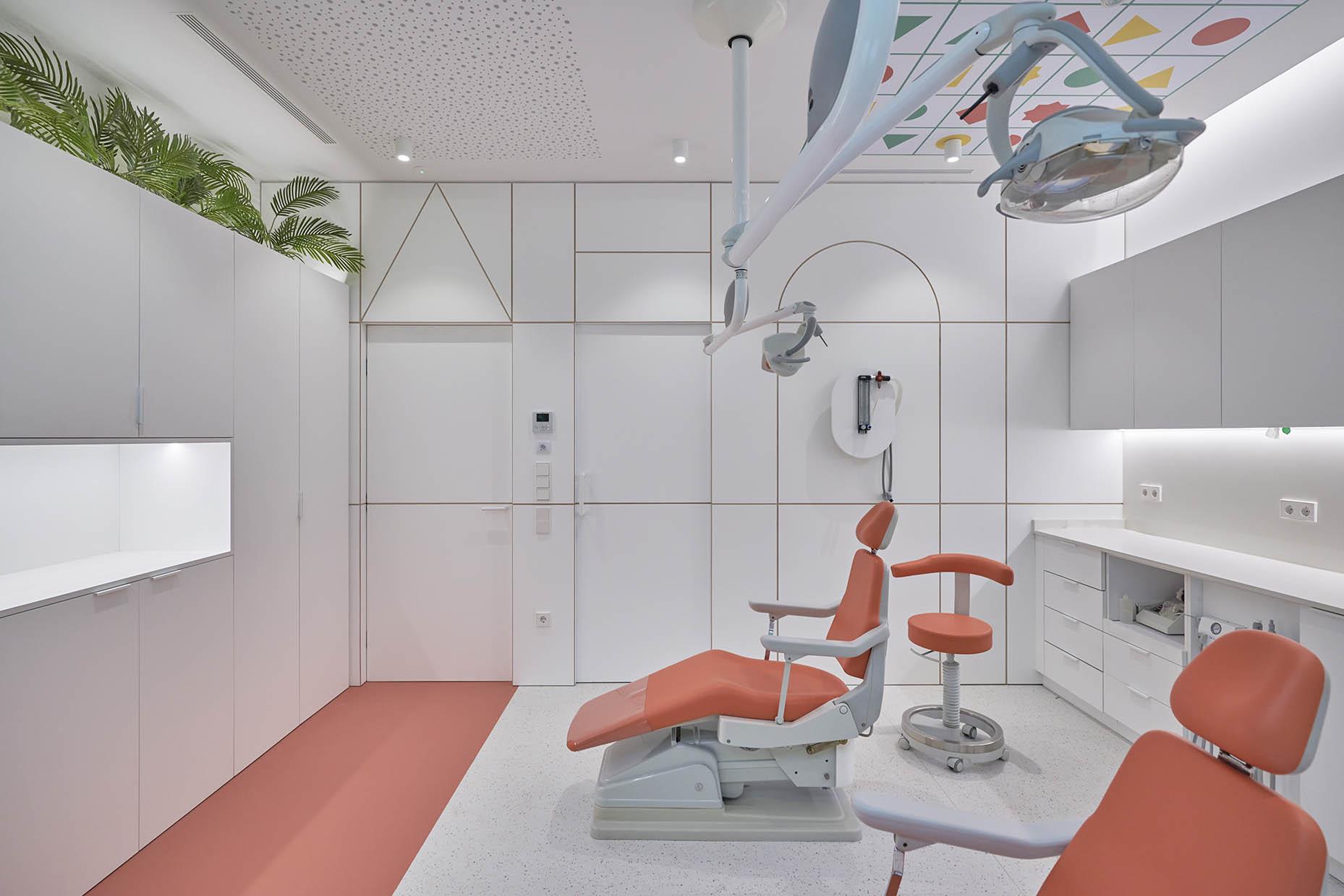
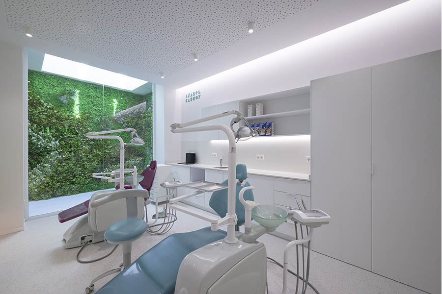
A second tunnel leads to the sedation room and treatment rooms, which are located at the rear of the clinic. Unlike traditional medical spaces, this area aligns with the overall design concept and is bathed in natural light from a skylight featuring a lush vertical garden.
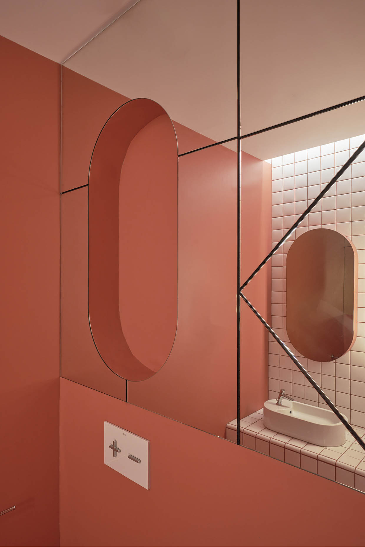
Selection of finishes for the children’s dental clinic
Maintenance and hygiene were crucial considerations in the clinic’s design. Continuous vinyl flooring was chosen for its durability, resistance to stains, and suitability for healthcare environments. Flooring extends up the walls in high-contact areas to protect surfaces. Additionally, ceramic wall coverings and decorative plywood paneling were used to ensure ease of cleaning.
The result is a space of well-being, safety, and knowledge that successfully merges educational elements with the clinic’s visual identity. This creates a direct and intuitive perception of Dr. Cadroy’s personality and her vision for pediatric dentistry. For adults, the space offers nostalgic references to childhood, while for children, it provides a comfortable and familiar environment. The clinic effectively communicates its corporate strategy, encouraging patients and their families to take an active role in learning about oral health.
If you want to know more clinic projects designed by Vitale, click here.
Interior Design: Vitale
Communication Strategy: Vitale
Branding: Vitale
Architecture and Project Management: Font Arquitectura
Photography: Vitale, Hilke Sievers
Location:: Castellón
Press: Diseño interior, Interior design, Interni decor, Proyecto contract
Online press: Trendland, Frame, Diseño interior, Interior design, Archello, 10 decoración, Wooooooow, Design verse, Room diseño.
Awards: Premio ADCV Impacto Positivo


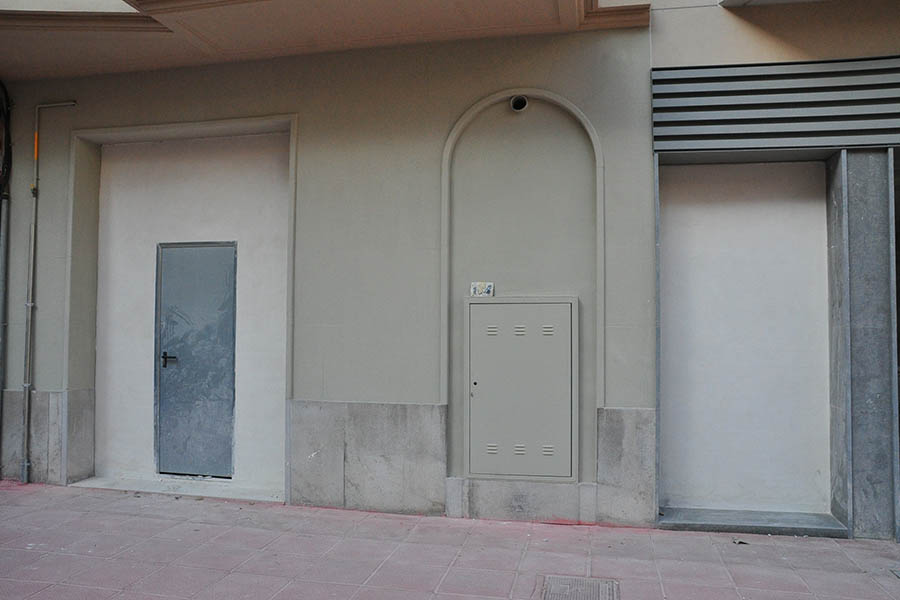
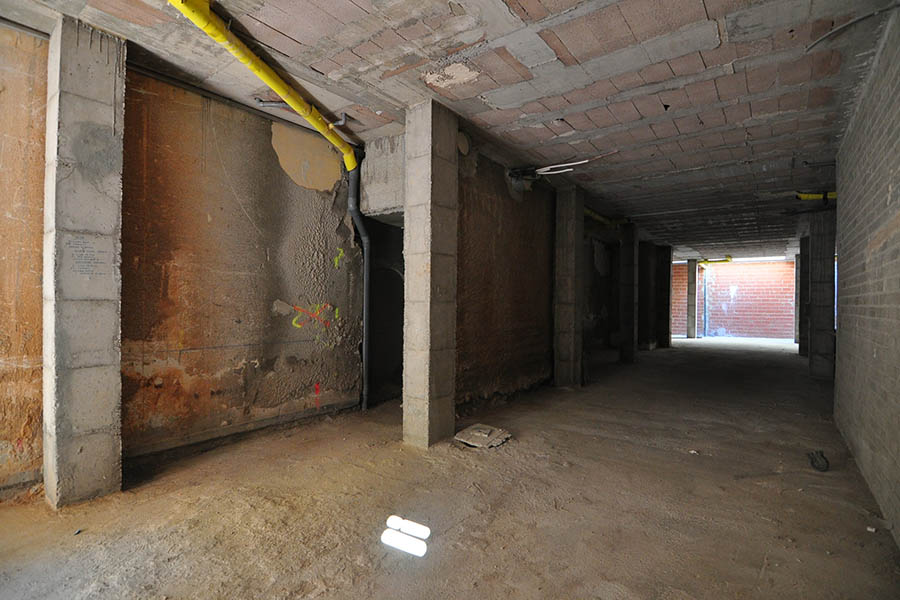
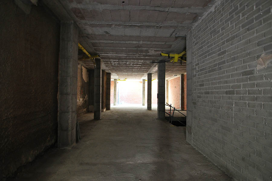
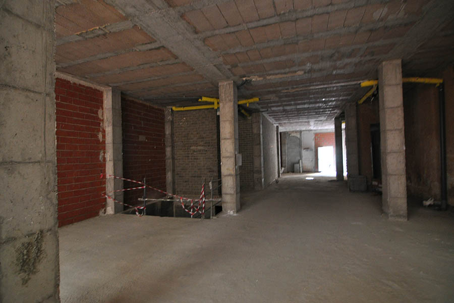
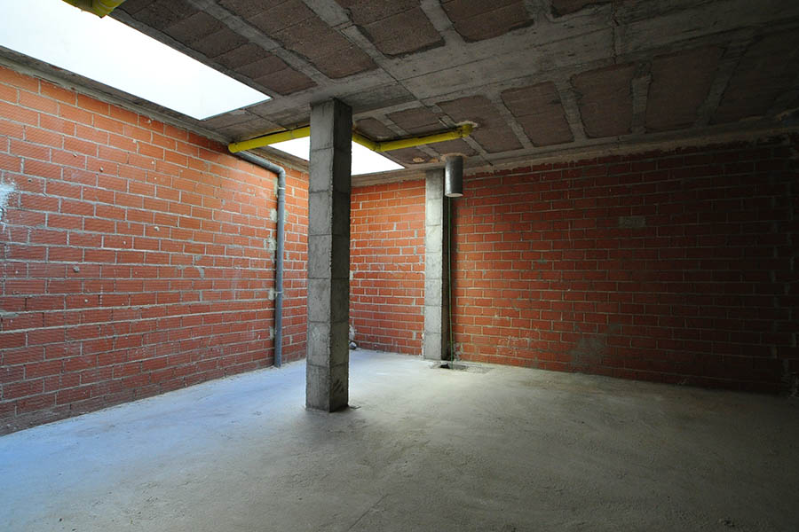
Before and After
The clinic was originally a ground-floor and basement unit in a newly constructed building. Natural light enters from the back, where the treatment rooms are now located. Despite the small façade, the project achieves a striking visual impact. Interior spaces were designed with a dynamic rhythm to counteract the elongated proportions of the premises.

Branding
The branding project reinforces the clinic’s corporate philosophy: educating families on oral health to improve patients’ quality of life. The creative concept draws from cognitive development learning methods. The brand identity is based on wooden building blocks and simple geometric puzzles, resulting in an honest, straightforward, and highly communicative visual identity. The typography was designed with a bold and structured look, reflecting the geometric language of children’s construction toys: “The brand is built using geometries”.